






An interactive carousel visually connects the cities, while the waves symbolize the sea, creating an immersive and fluid experience from the very first moment.

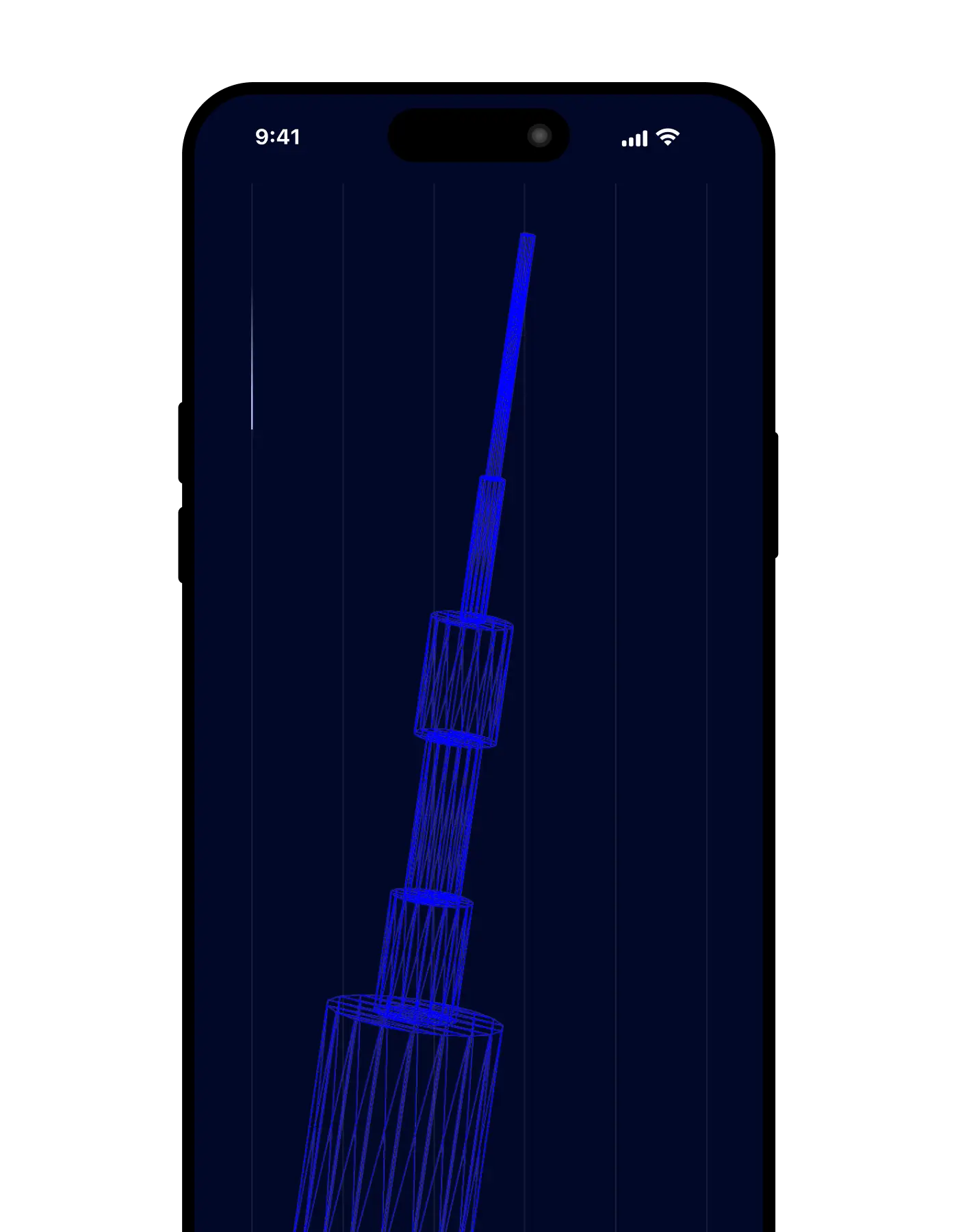
I created a 3D model of the interactive cable with Spline, with lines symbolizing global internet connections, conveying technology and connectivity.

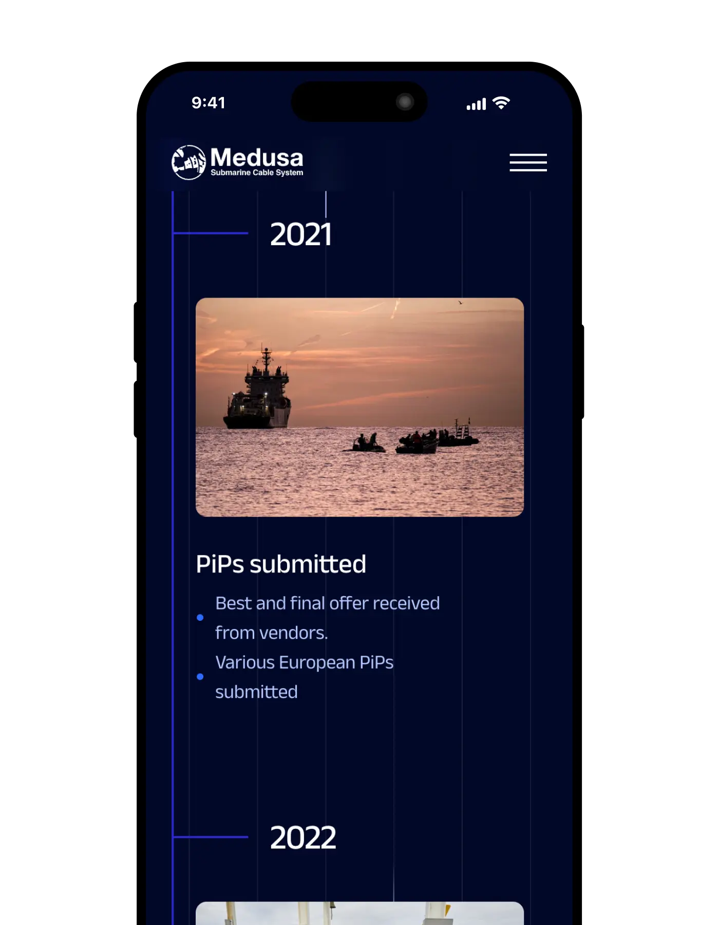
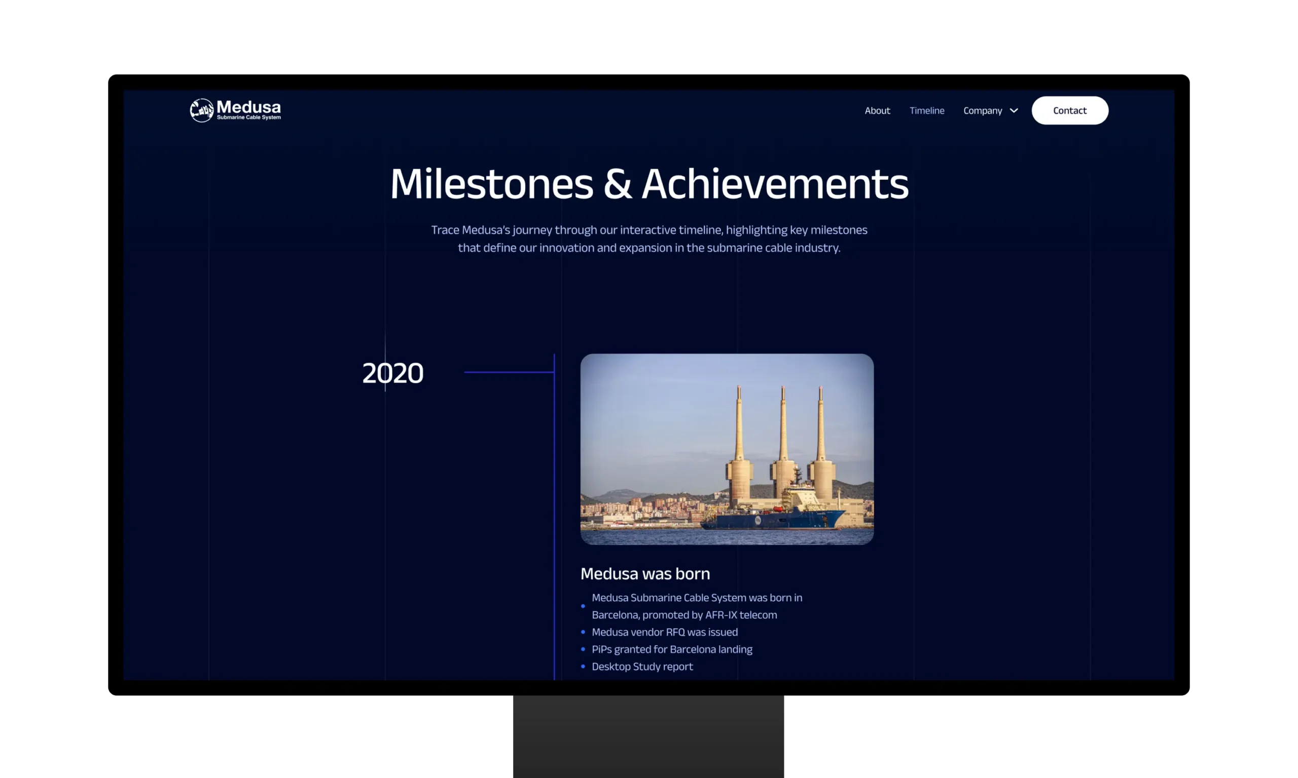
The timeline presents Medusa's key milestones in an interactive way, making it easy for users to explore its evolution in the submarine cable industry.


This web design for Romano Glass highlights their mission with a minimalist and sophisticated approach. The contrast of white typography on a dark background reflects elegance, aligning the visual style with the quality of their glass products.

Romano Glass stands out for its clean design and focus on exclusive, high-end glass products, establishing itself as a benchmark in the glazing market with a European touch.

Romano Glass' interactive portfolio presents its featured projects in a clean and functional layout. Each image is harmoniously integrated with intuitive filters, allowing users to browse by service, location and year.


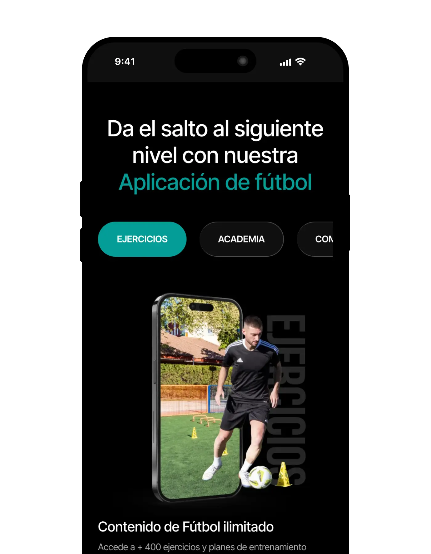

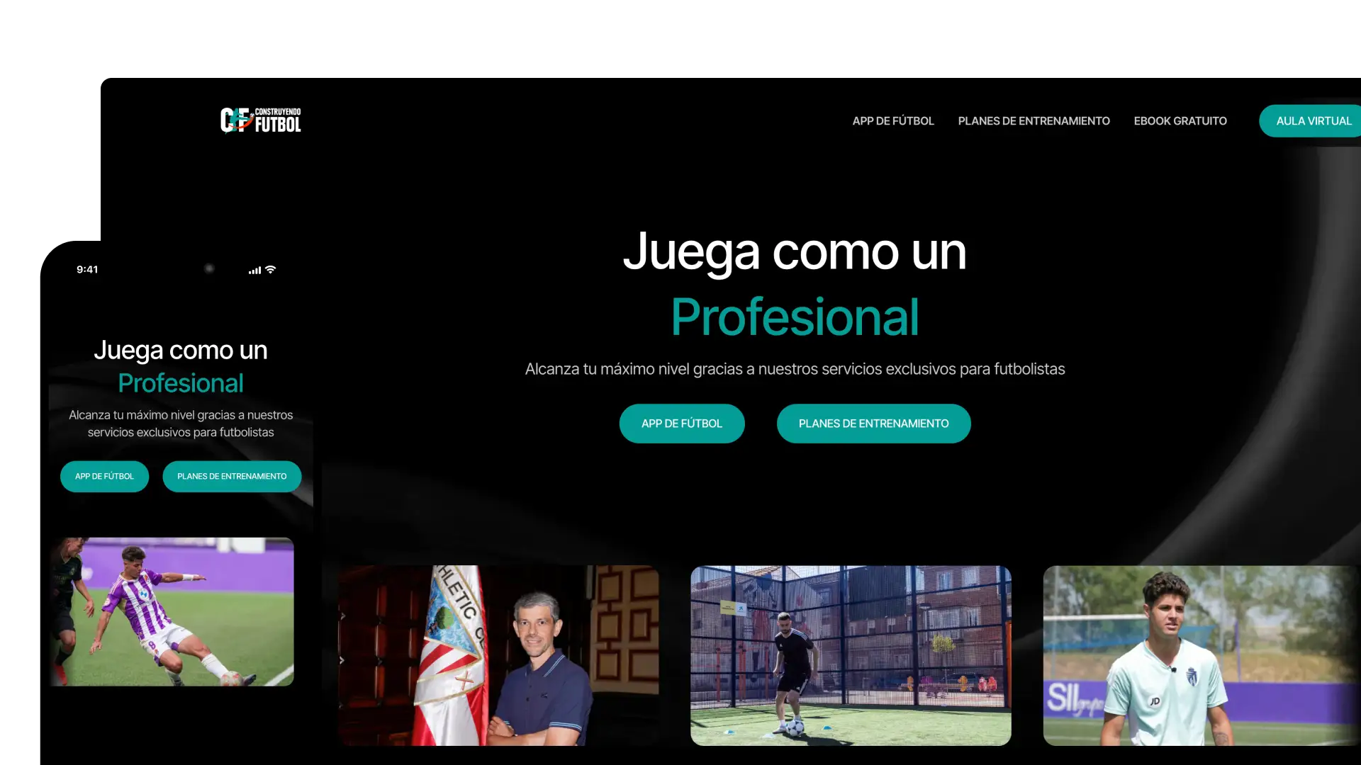
A dynamic mockup that uses a video game-style hexagonal graphic to reflect the evolution of the player's skills, highlighting key areas of improvement in performance and skill.

An intuitive tabulator allows you to interactively explore the different areas of improvement that the app offers, from technical skills to physical performance, providing a personalized experience for each player.

An interactive carousel featuring all available trainers, optimized for smooth viewing on both mobile and desktop devices, ensuring an engaging experience.


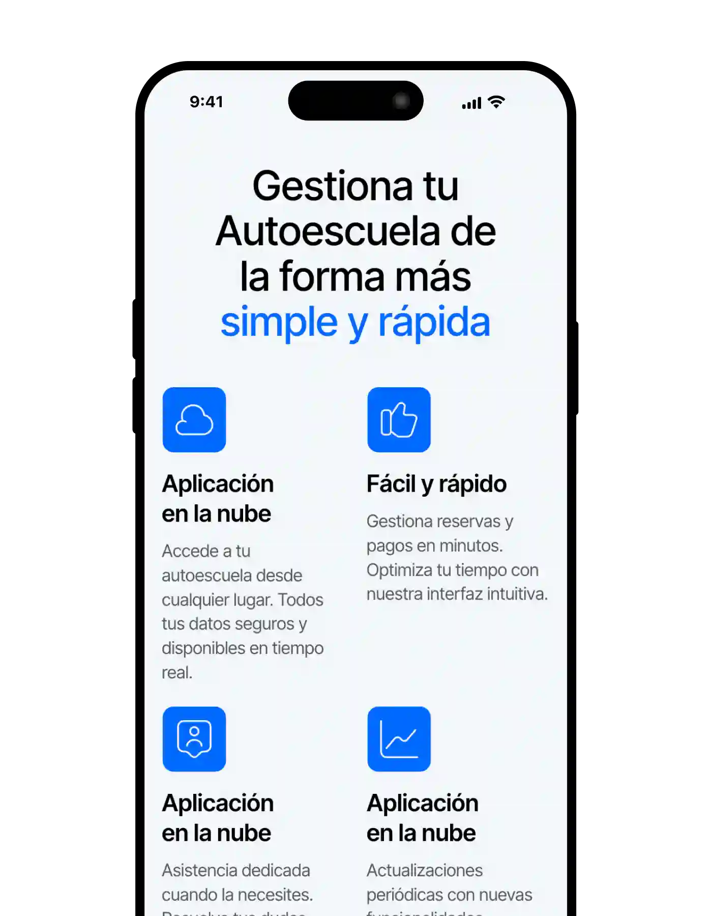

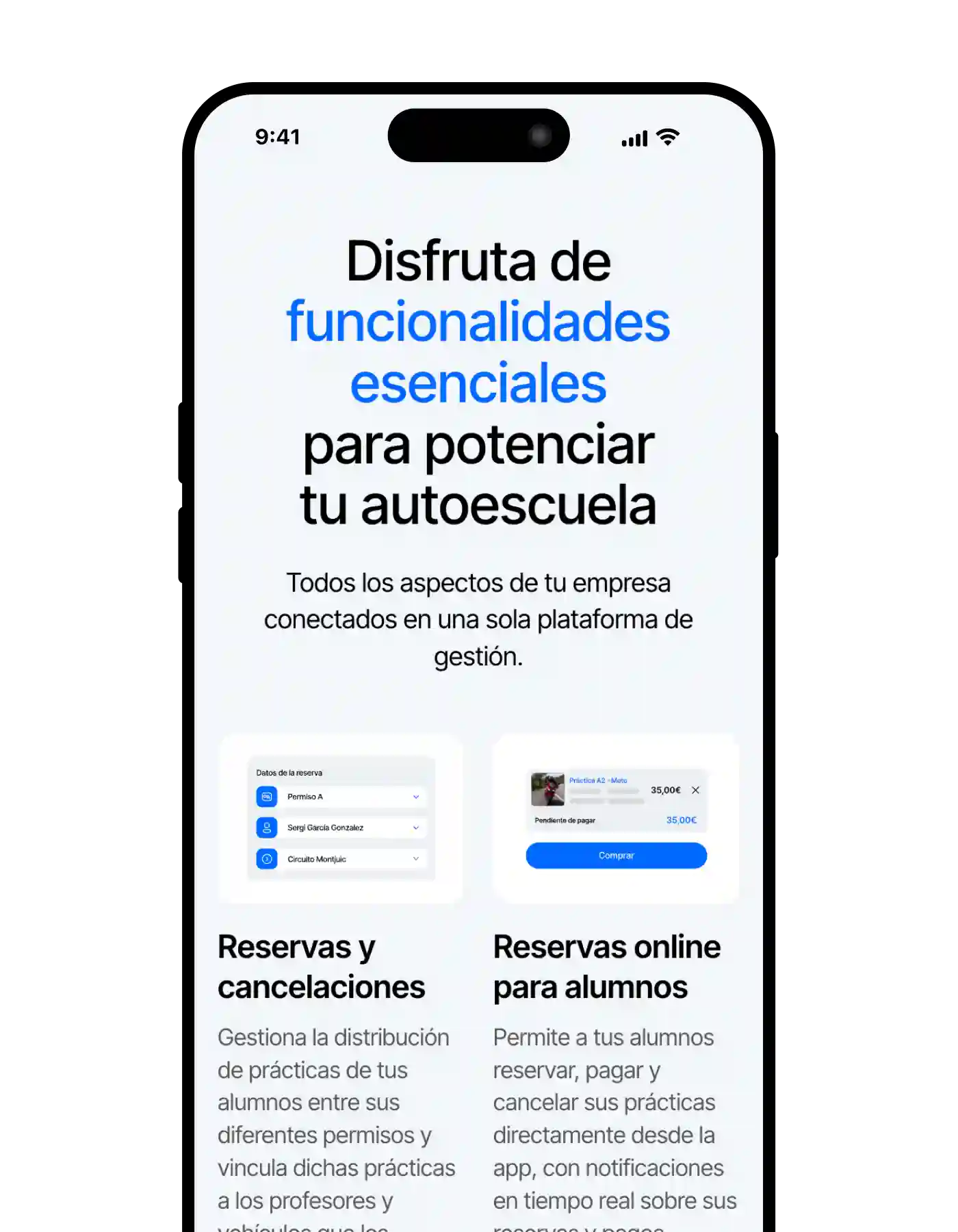
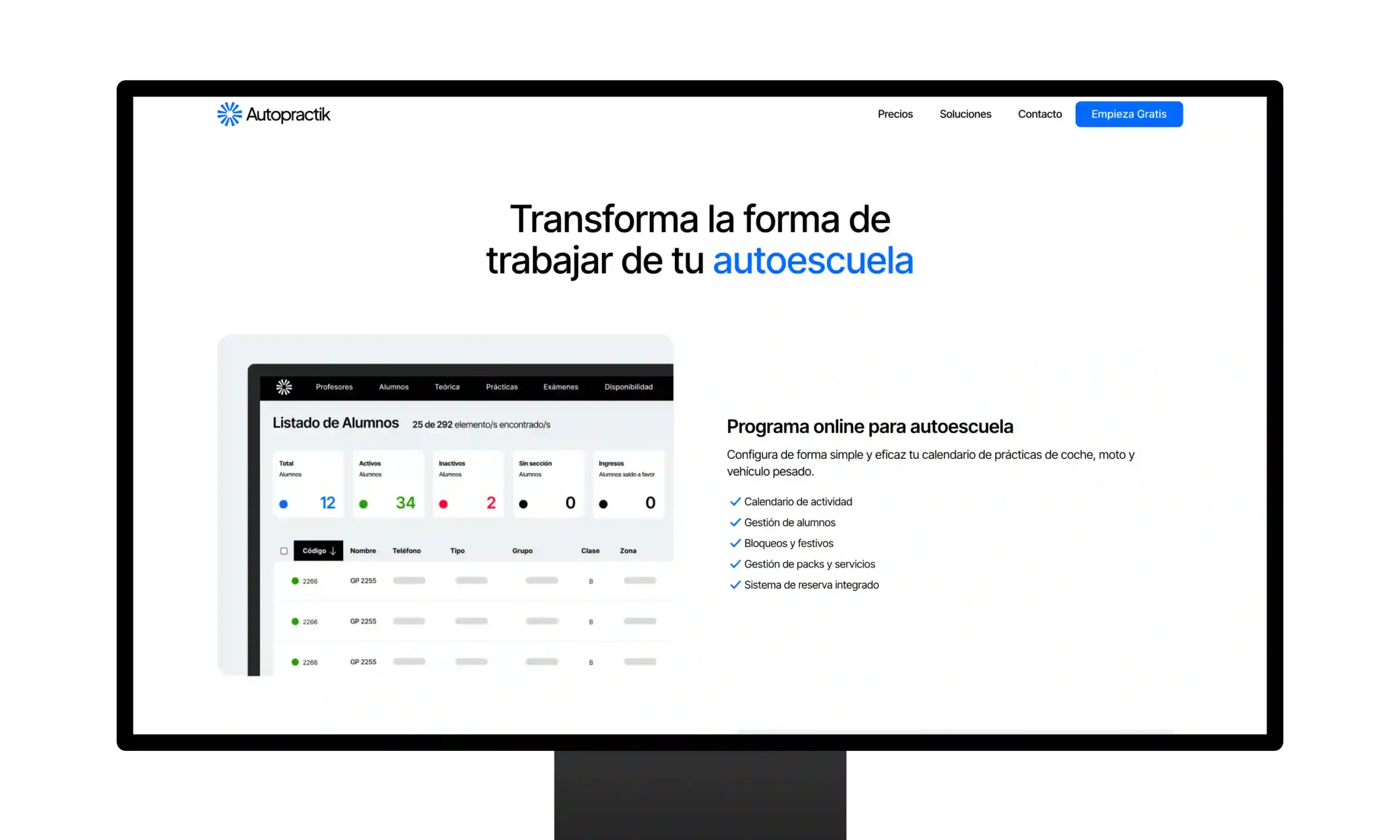
Minimalistic mockup sections highlight AutoPractik's new features, providing a clear and elegant view of each tool designed to enhance your training experience in an intuitive and effective way.
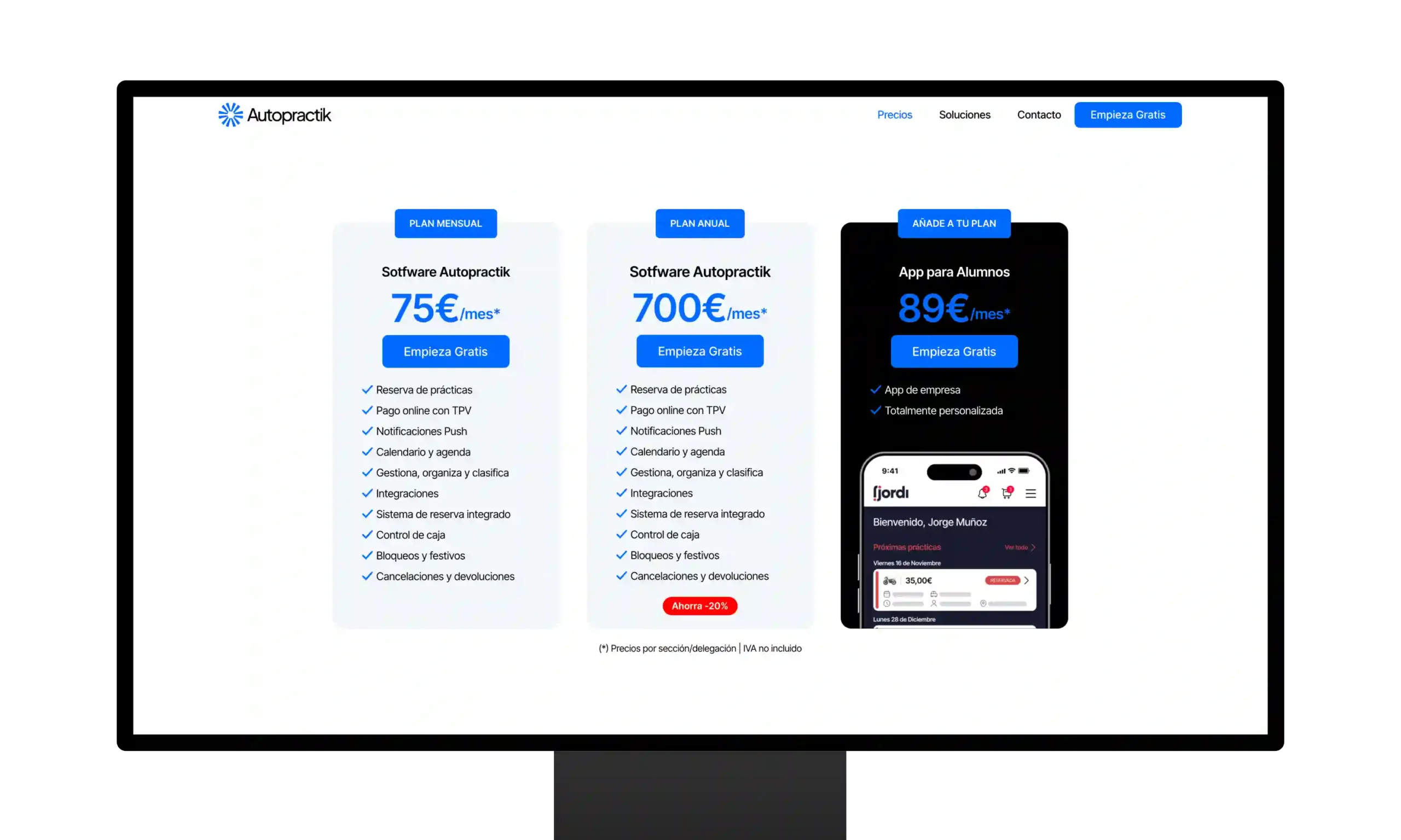
An interactive section allows you to switch between monthly or annual payments, with prices clearly grouped and organized for you to choose the option that best suits your needs.
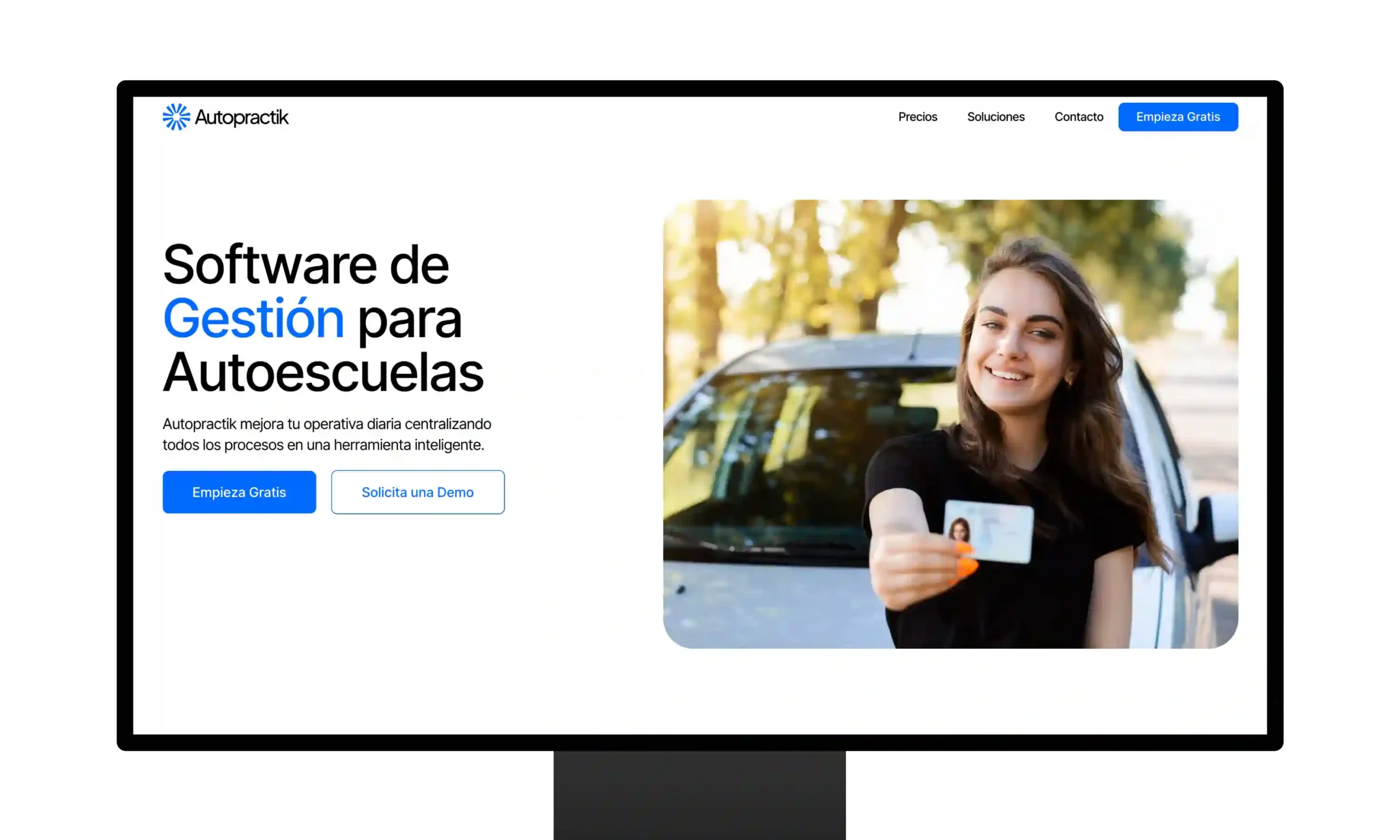
Explore the key advantages of AutoPractik in this section dedicated to showcasing the benefits of the tool, with a clear design that highlights how it can improve your performance and facilitate your training.

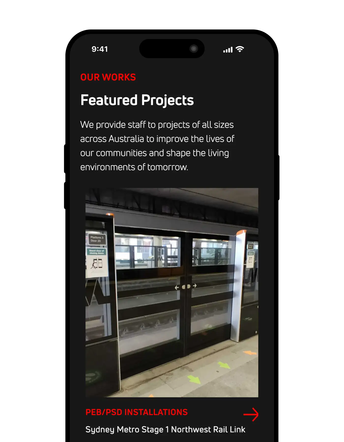

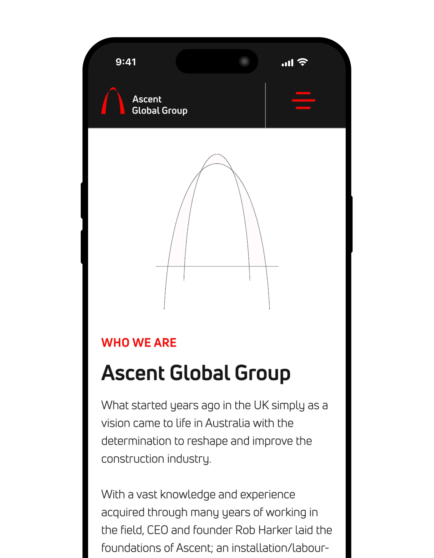
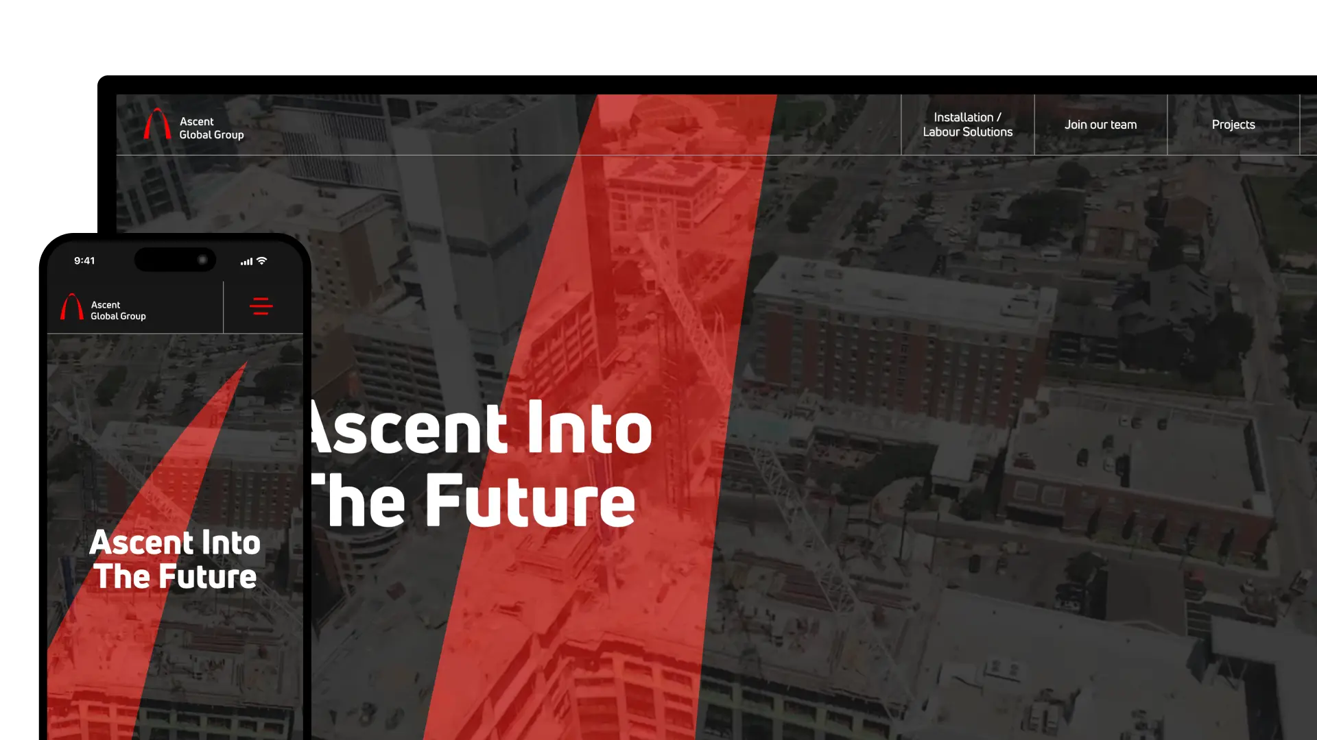
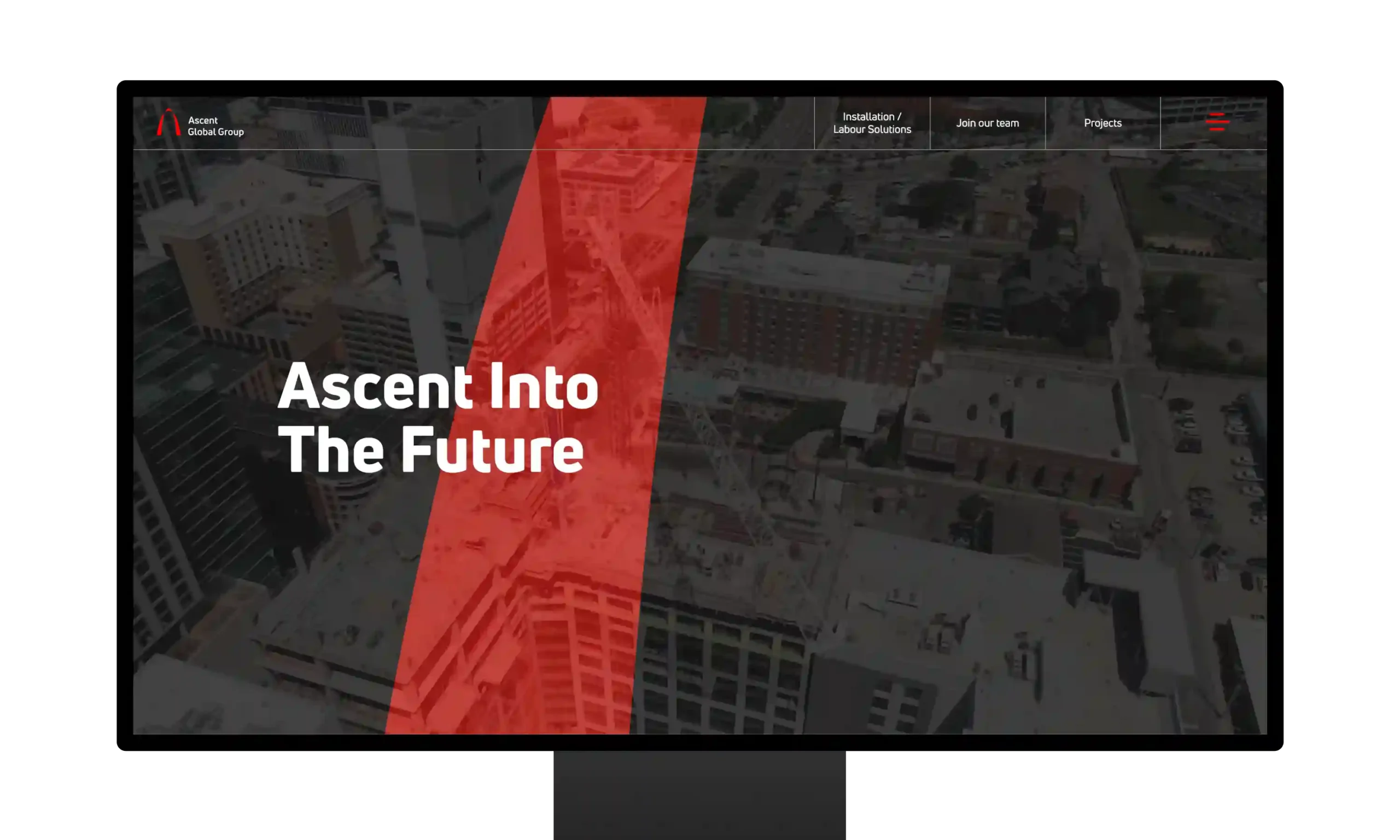
The striking cover with colors and contrasts reinforces the company's futuristic vision, inviting users to explore its installation solutions and innovative projects.
The design reflects the company's core values, using strong typography on a dark background. The visual image complements the message of effort and safety, highlighting the commitment to quality.

With a straightforward and visually appealing interface, this section makes it easy to apply or join the team, highlighting the importance of talent within the organization.


The design emphasizes the platform's ease of use, allowing users to manage, classify and organize their customer information with a simple and functional visual approach.

I have designed a clear and modern interface that highlights how Gespromo helps transform work processes. The visual layout simplifies customer management, allowing for quick editing and organization of data.

The news section uses a clean, minimalist approach to report on the latest software updates. The use of soft colors reinforces the idea of constant innovation and continuous improvement.


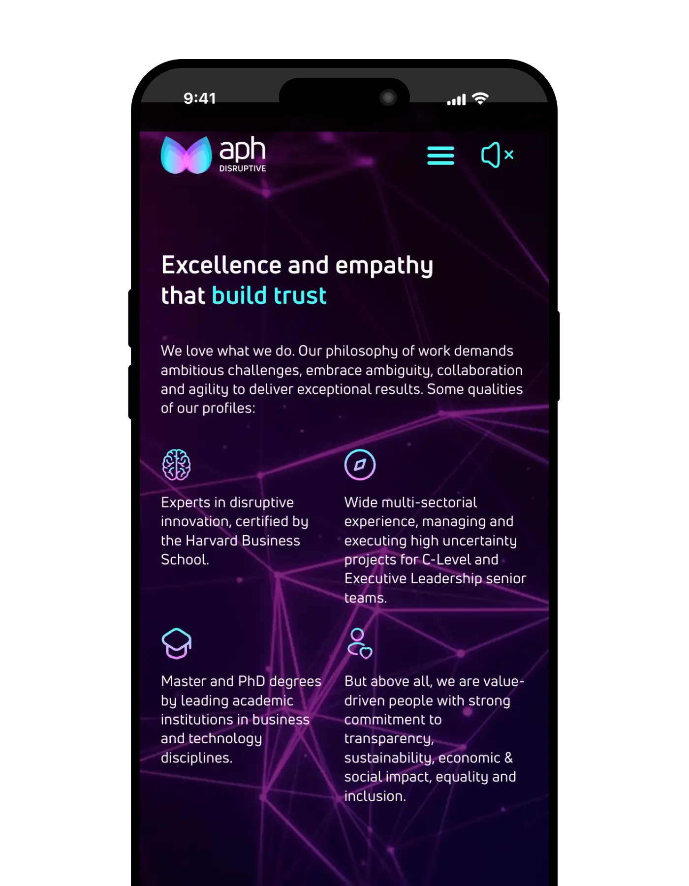
I designed an interface that reflects their innovative approach, with an effective use of dark elements and subtle light effects. The presentation emphasizes their value proposition, highlighting the disruptive strategy and their training formats through a clear and modern navigation.
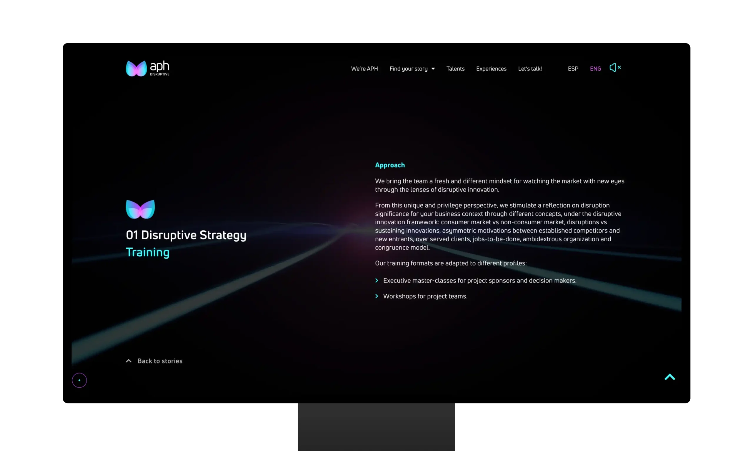
The focus section uses vibrant colors and dark contrasts to highlight each service. Each visual block presents a clear narrative, guiding the user through the different areas of research, design and training in disruptive innovation.

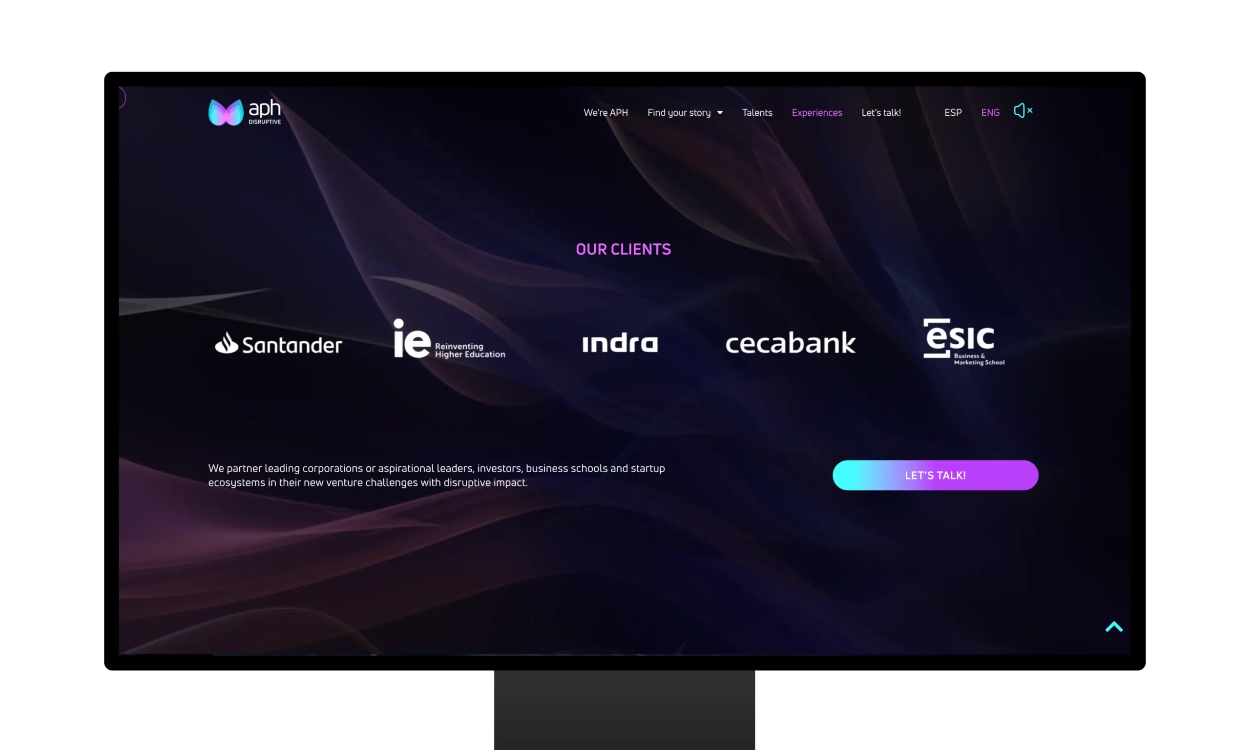
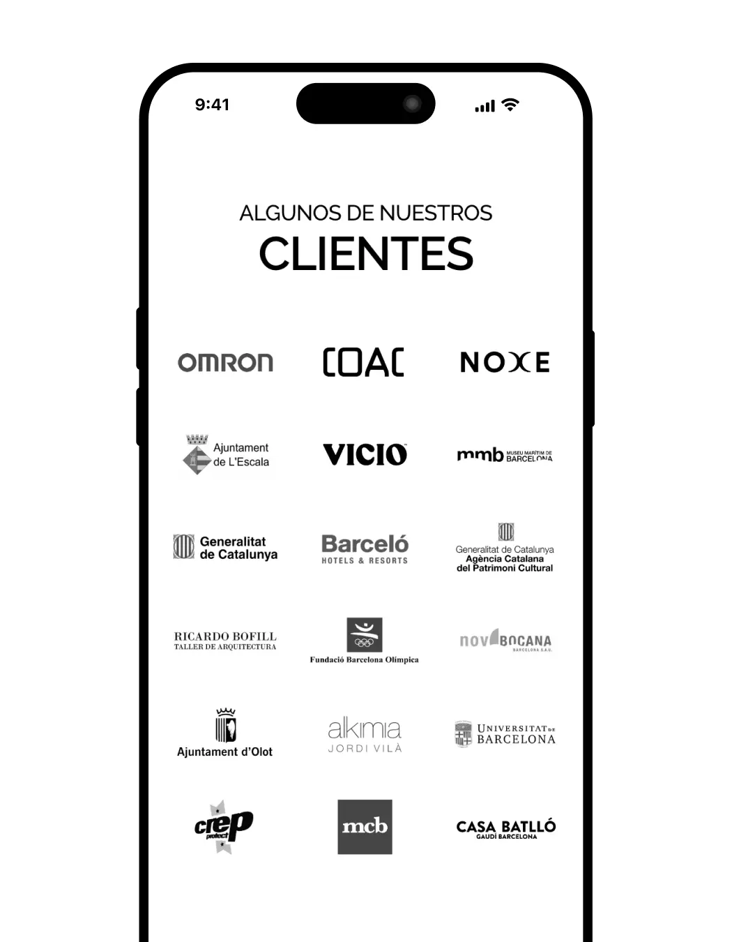
I designed a visual presentation for the client section that highlights the leading companies that trust APH Disruptive. The logos are elegantly integrated on a dynamic dark background, reinforcing the image of professionalism and trust.
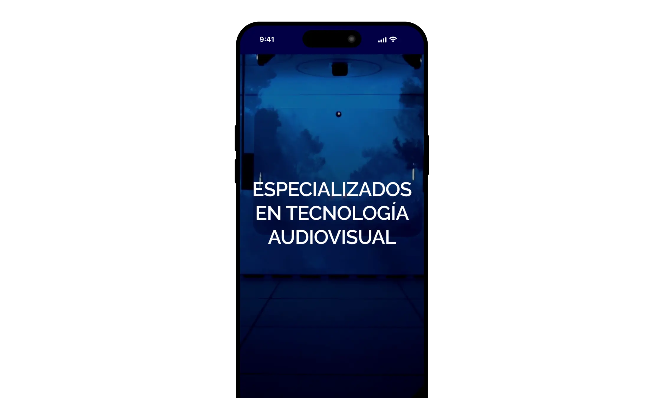
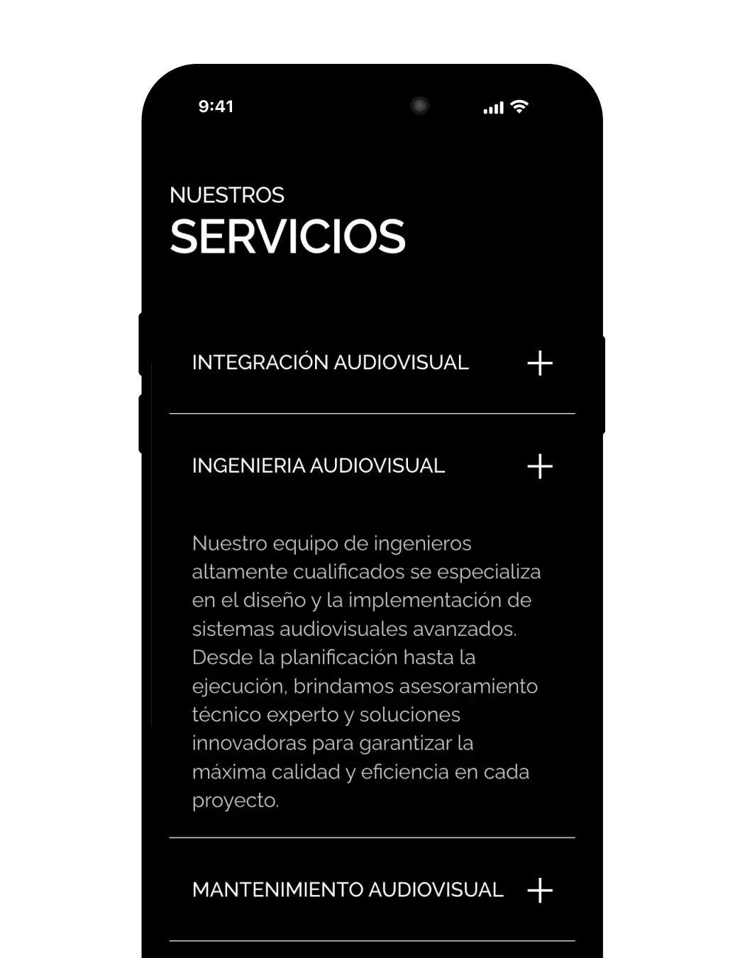
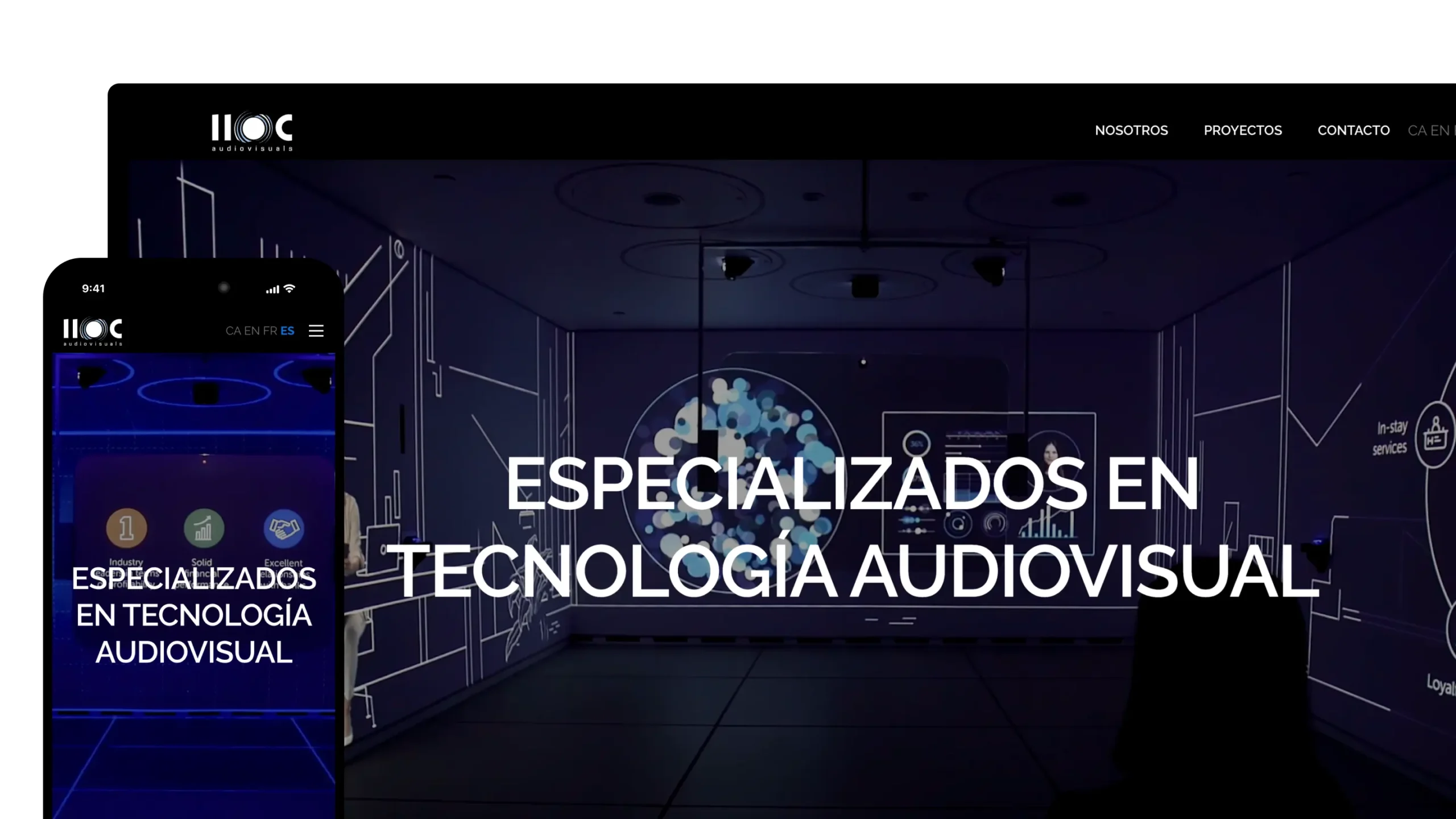
The home page is designed to immediately capture the user's attention, with a full-screen video. The use of white typography on a visual background in dark tones creates an attractive contrast that guides the user to action.

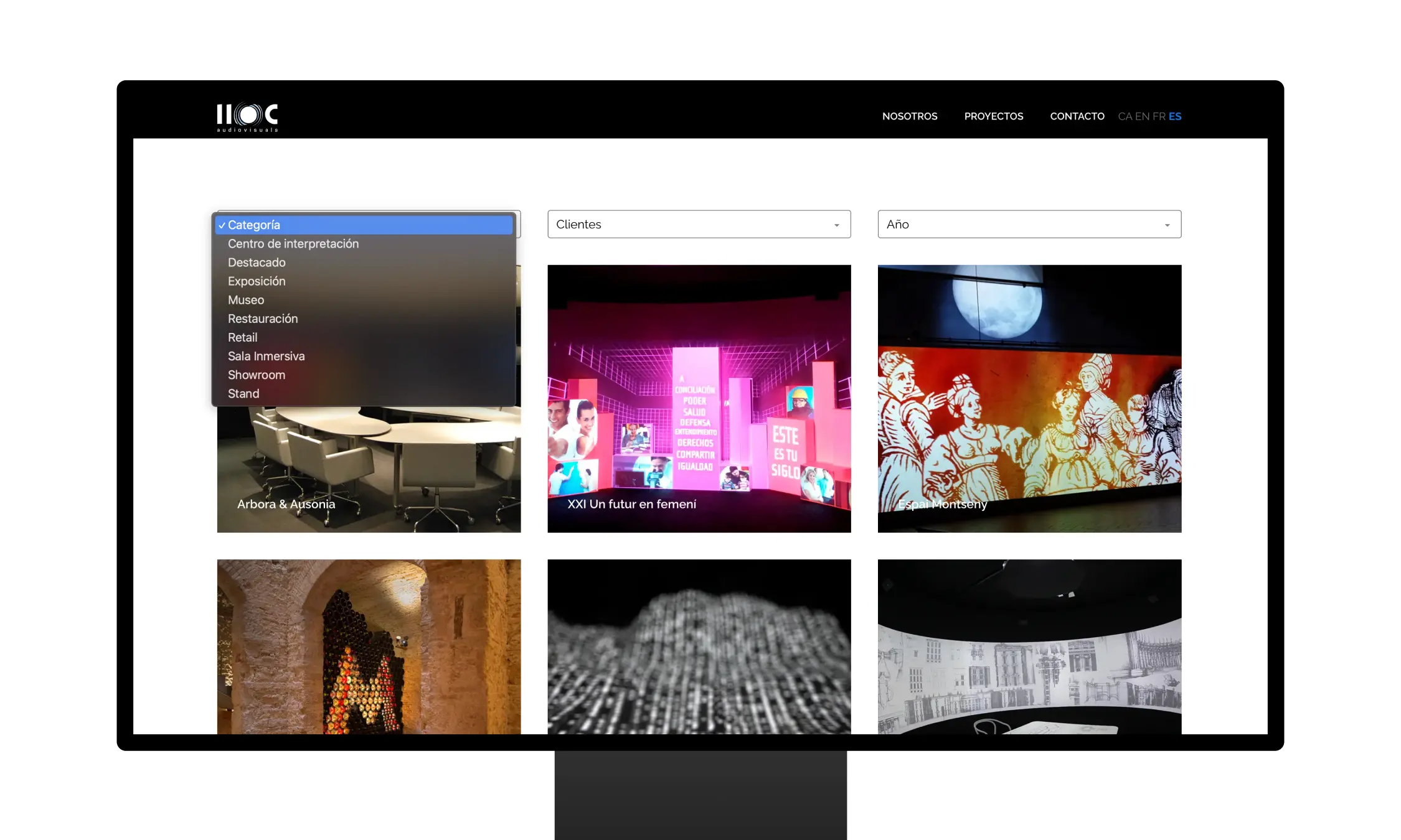
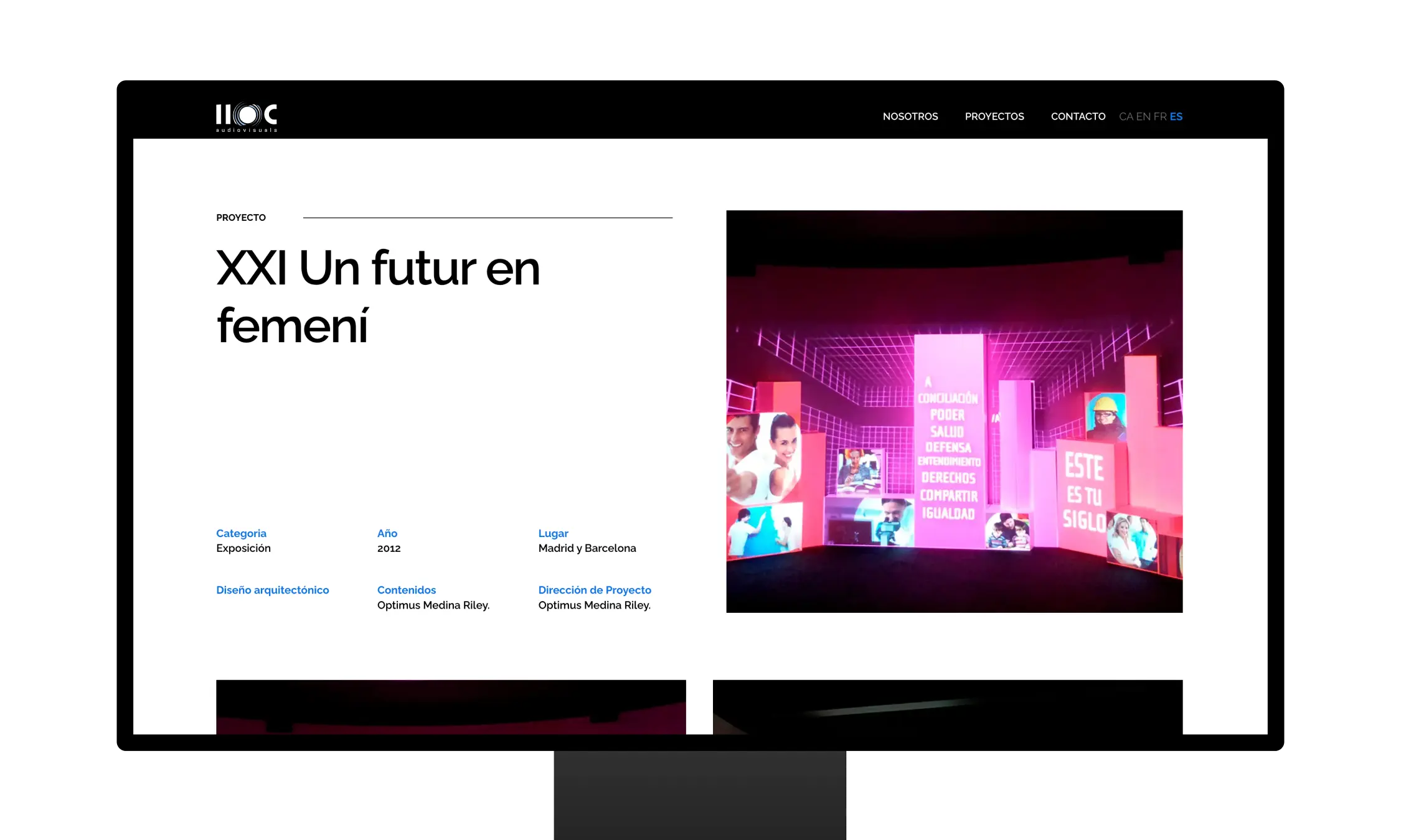
The portfolio design allows easy navigation and filtering of projects by category, client and year. Visual thumbnails offer a dynamic preview, while the minimalist structure facilitates an intuitive user experience.
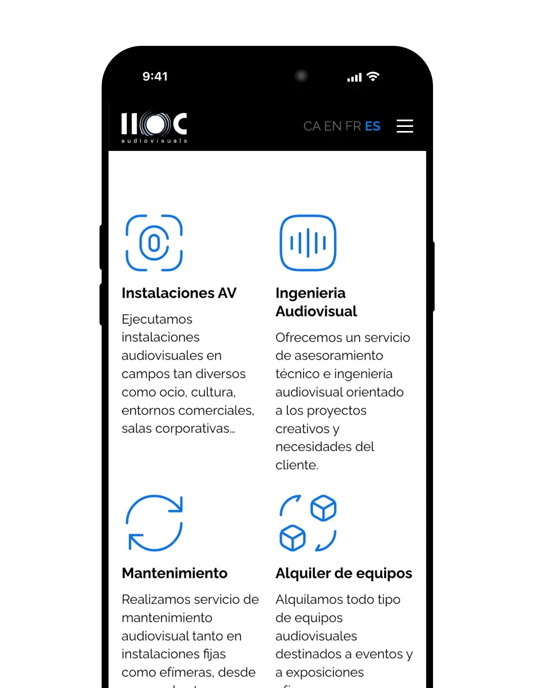
This section highlights Lloc Audiovisuals' specialties, using immersive images that illustrate audiovisual technology in action. The combination of a dark color palette with striking visual elements reinforces the company's innovative identity.


Please complete this form as accurately as possible. This will enable me to respond to you more efficiently.
Get startedFor any inquiries, email me at
info@jorgeml.comBy submitting this form, you accept the
Privacy Policy