






The login design offers multiple access options, simplifying the user experience. The clear layout of buttons and shortcuts to social networks improve accessibility, optimizing the authentication flow.

The app 's home screen is designed to motivate users with high quality images and a clear CTA, creating a visually stunning experience that invites them to train like a pro. The use of clean typography and a minimalist interface ensures smooth navigation.
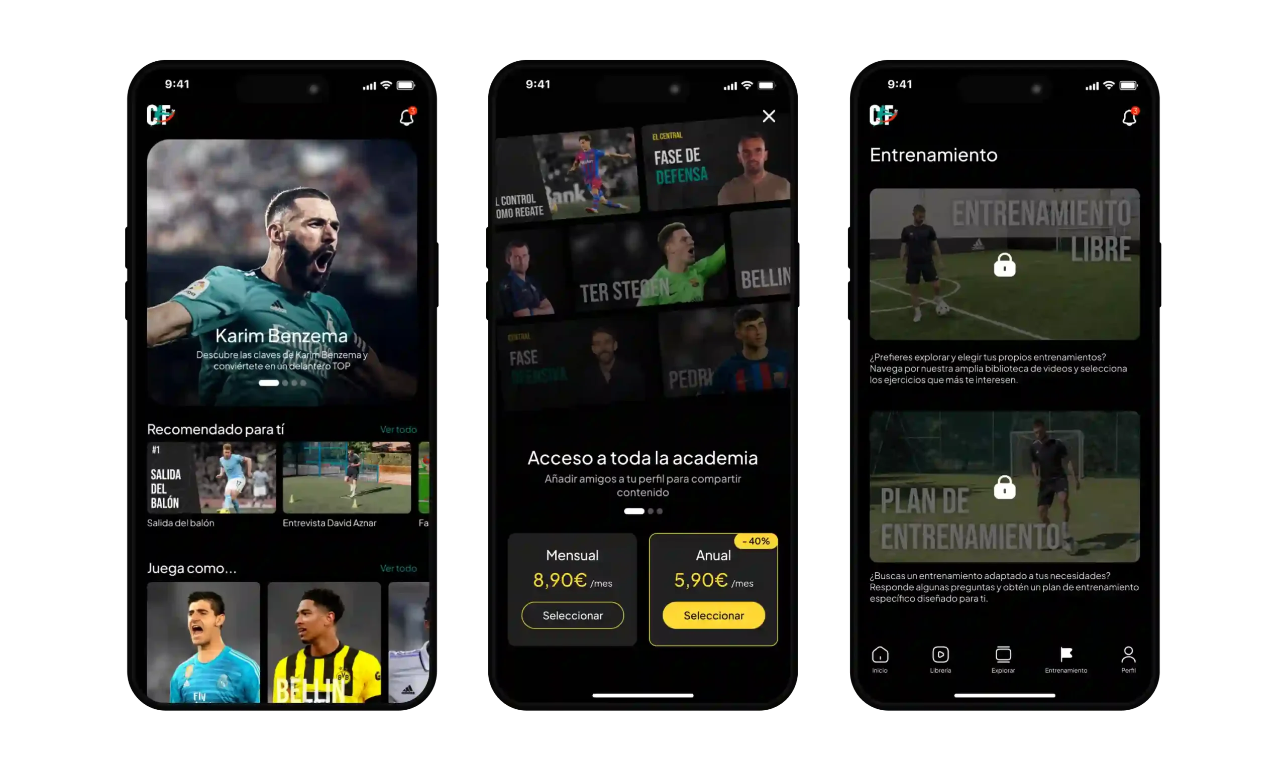
With a design focused on usability, the app allows users to access exclusive content, trainings and personalized profiles. The visual organization ensures that each section is easily accessible, enhancing the user experience (UX) and user interface (UI).


An interactive carousel visually connects the cities, while the waves symbolize the sea, creating an immersive and fluid experience from the very first moment.

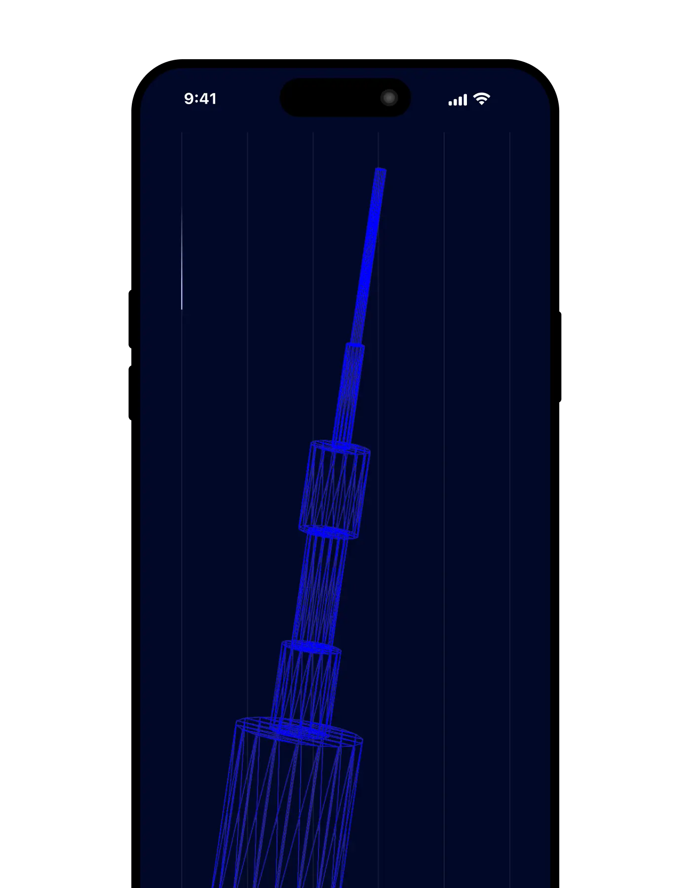
I created a 3D model of the interactive cable with Spline, with lines symbolizing global internet connections, conveying technology and connectivity.

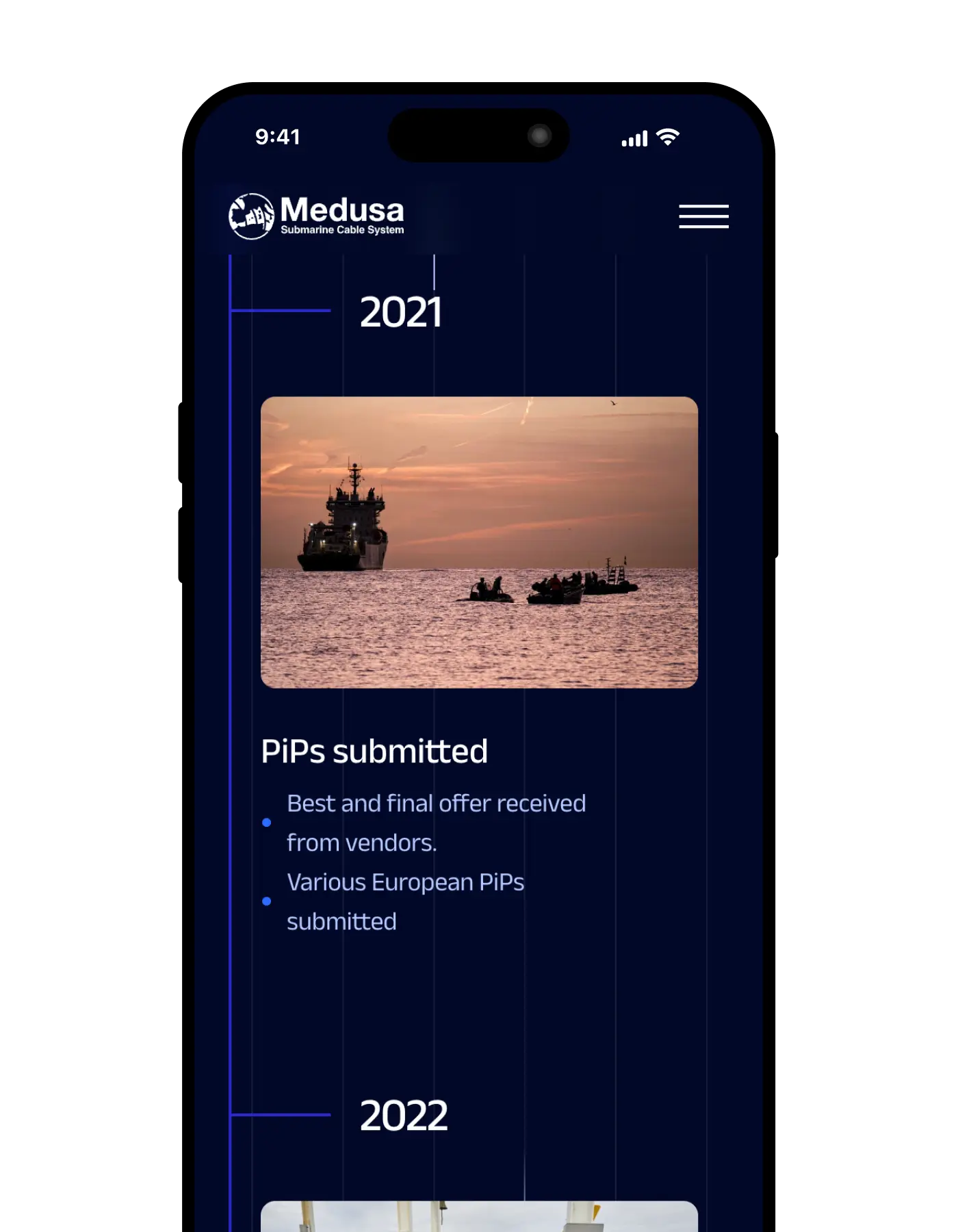
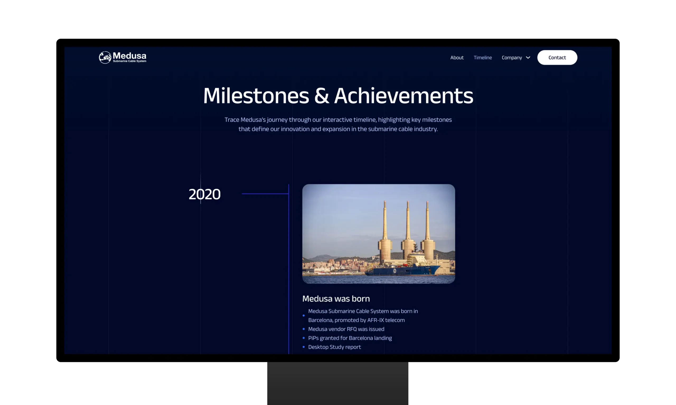
The timeline presents Medusa's key milestones in an interactive way, making it easy for users to explore its evolution in the submarine cable industry.


This web design for Romano Glass highlights their mission with a minimalist and sophisticated approach. The contrast of white typography on a dark background reflects elegance, aligning the visual style with the quality of their glass products.

Romano Glass stands out for its clean design and focus on exclusive, high-end glass products, establishing itself as a benchmark in the glazing market with a European touch.

Romano Glass' interactive portfolio presents its featured projects in a clean and functional layout. Each image is harmoniously integrated with intuitive filters, allowing users to browse by service, location and year.





Autopractik's logo combines modernity and simplicity, representing the letter "A" through a symbol that emulates an automobile tire, connecting directly with the automotive sector and driving schools. This versatile design works perfectly in a variety of branding applications.
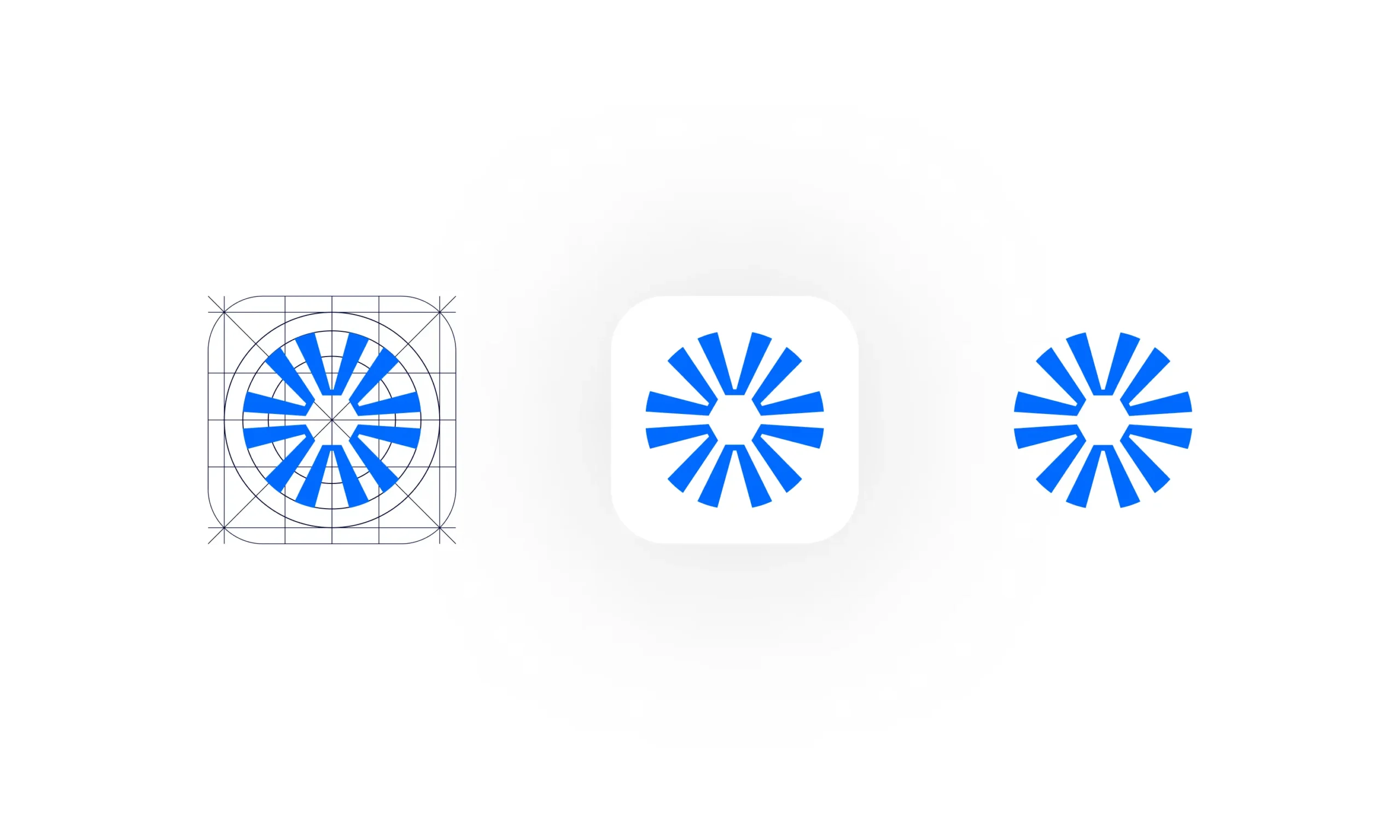
The logo has been designed with a grid that ensures perfect proportion and alignment. The vibrant blue reinforces the brand's technology, while the modern typography creates a sense of confidence and professionalism.

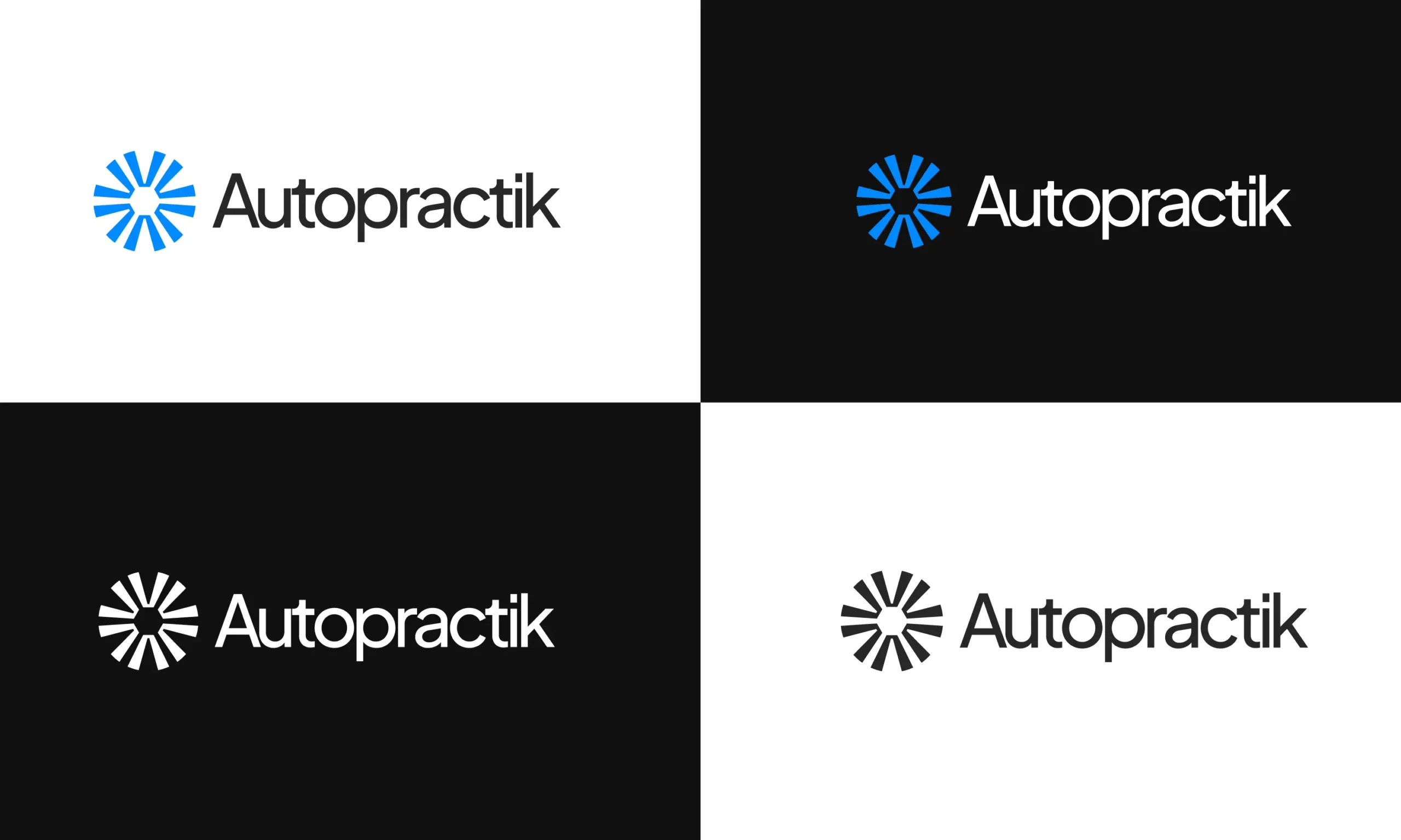
The logo design has been adapted to work optimally in black and white versions, allowing its application in different contexts, without losing its visual strength and clarity.


The online store is intuitively organized with category, color and price filters. This design makes it easy for users to quickly find the products they are looking for, enhancing the browsing experience.

The product page design highlights technical details in an organized manner, allowing the user to add items to the cart with a single click. The interface ensures fast and clear navigation.

I have developed a clear and efficient shopping cart design, where users can review their products, update quantities and choose shipping options with ease, optimizing the shopping experience.


The home screen of this driving practice app features a clean and structured layout, allowing users to view and book their upcoming sessions with ease. Colors highlight available and booked practices, enhancing the user experience.
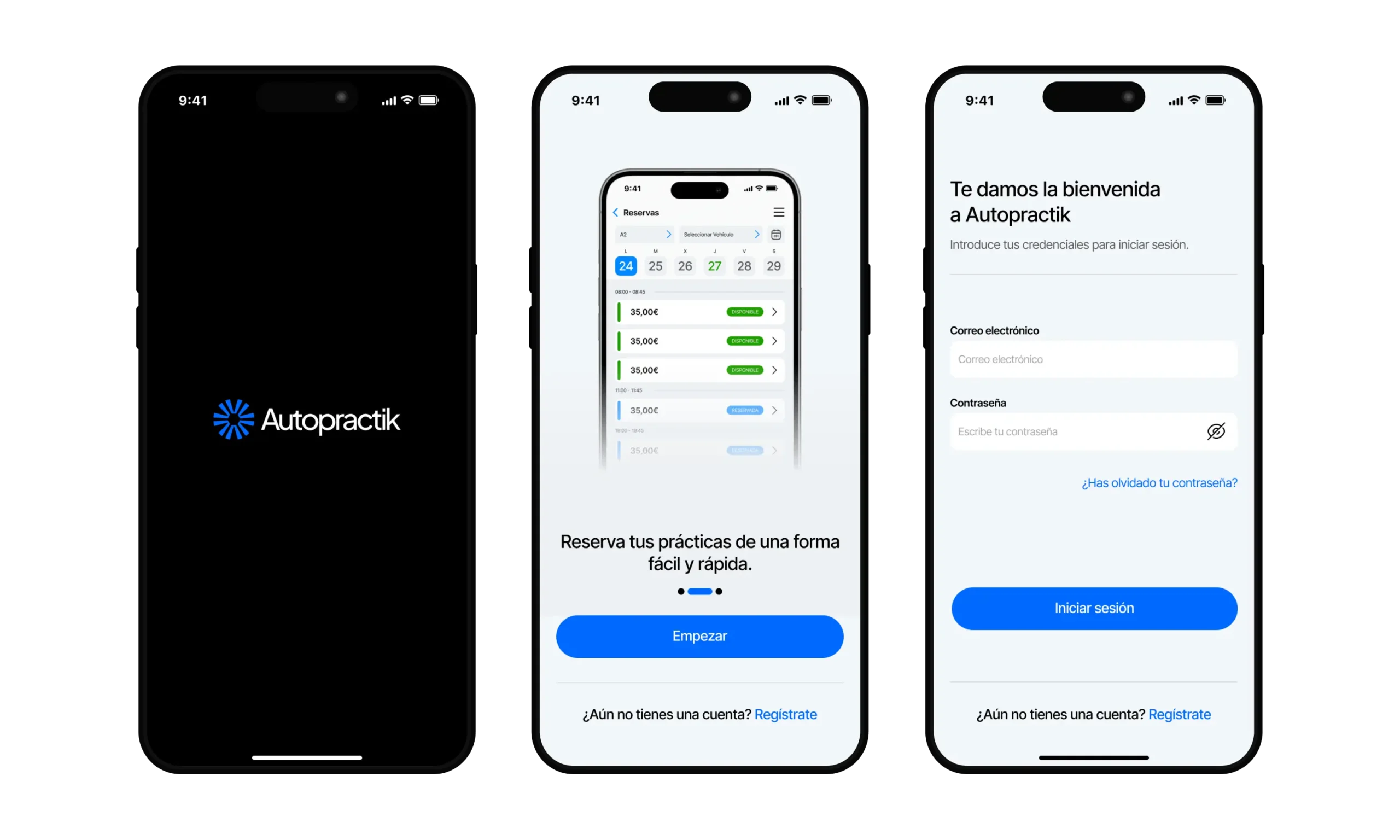
The profile design includes visual graphics and financial details, allowing the user to keep track of their practices and balance efficiently. Data visualization is presented in a clear and understandable way, optimizing the UX.

I designed the main menu to provide quick access to all key functions, from practice history to profile management. The interface is intuitive, with smooth navigation that facilitates the daily use of the app.


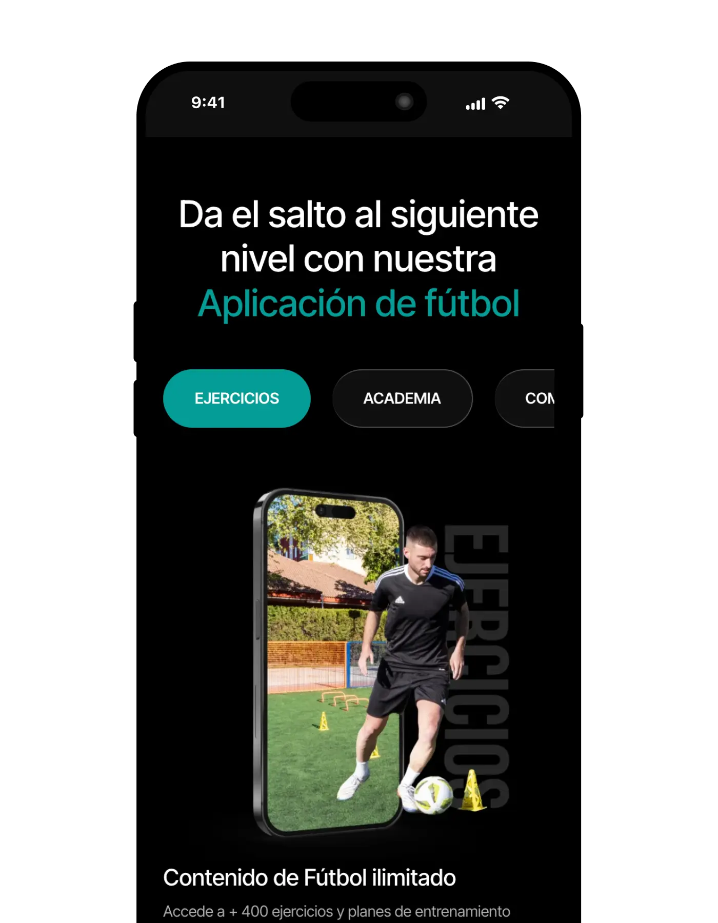

A dynamic mockup that uses a video game-style hexagonal graphic to reflect the evolution of the player's skills, highlighting key areas of improvement in performance and skill.

An intuitive tabulator allows you to interactively explore the different areas of improvement that the app offers, from technical skills to physical performance, providing a personalized experience for each player.

An interactive carousel featuring all available trainers, optimized for smooth viewing on both mobile and desktop devices, ensuring an engaging experience.


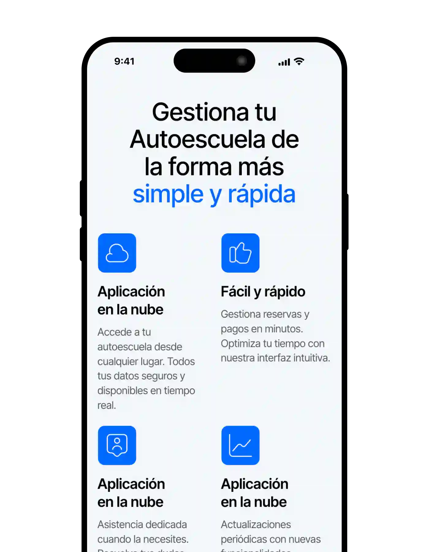

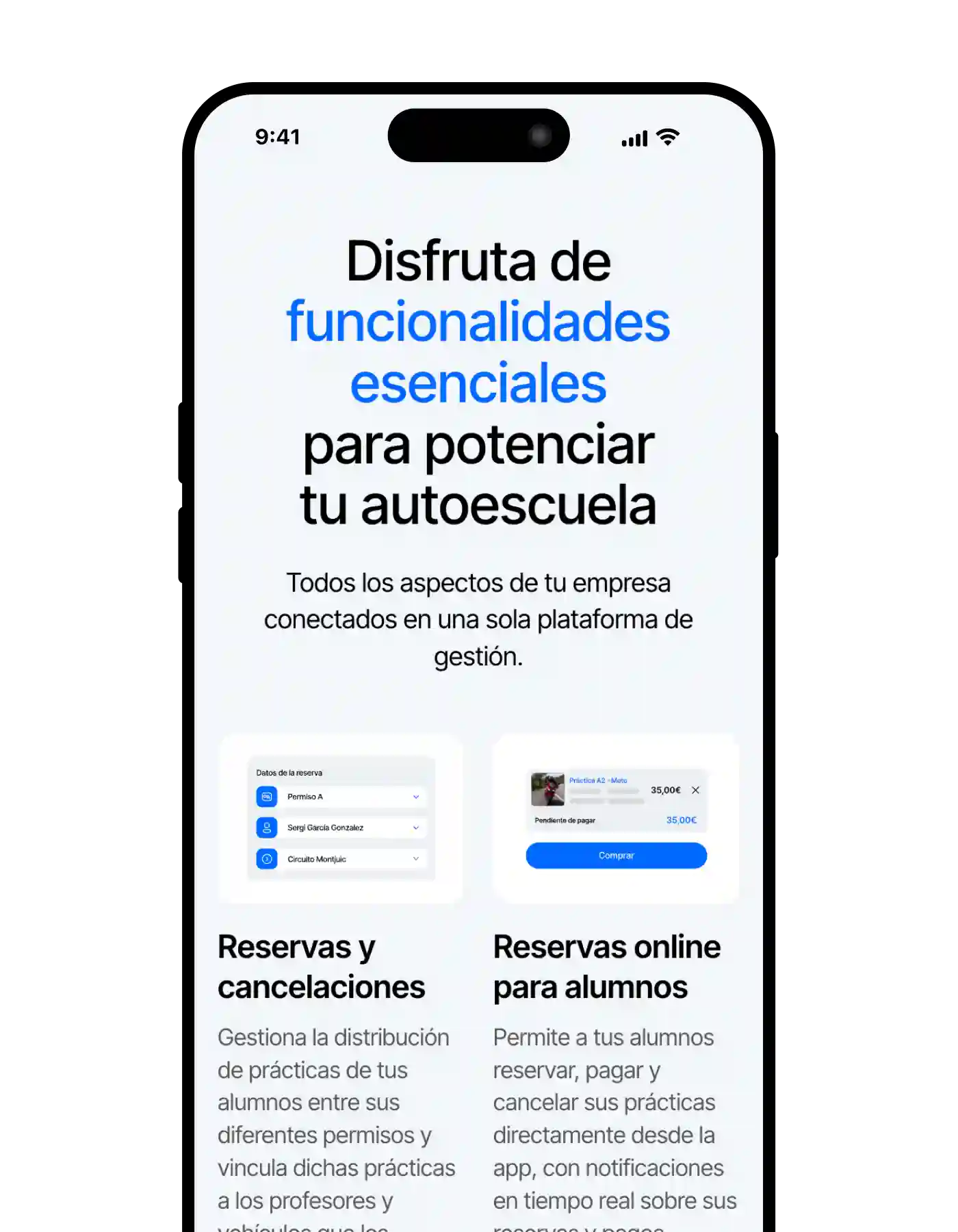
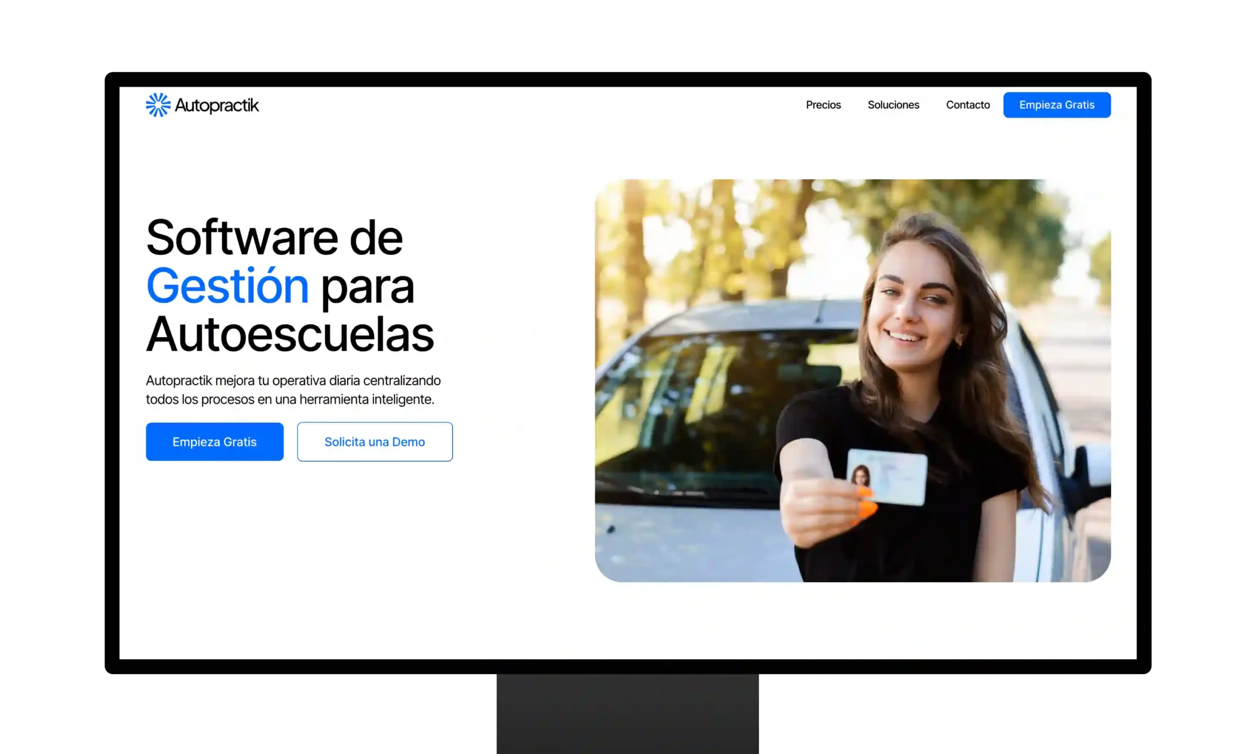
Minimalistic mockup sections highlight AutoPractik's new features, providing a clear and elegant view of each tool designed to enhance your training experience in an intuitive and effective way.
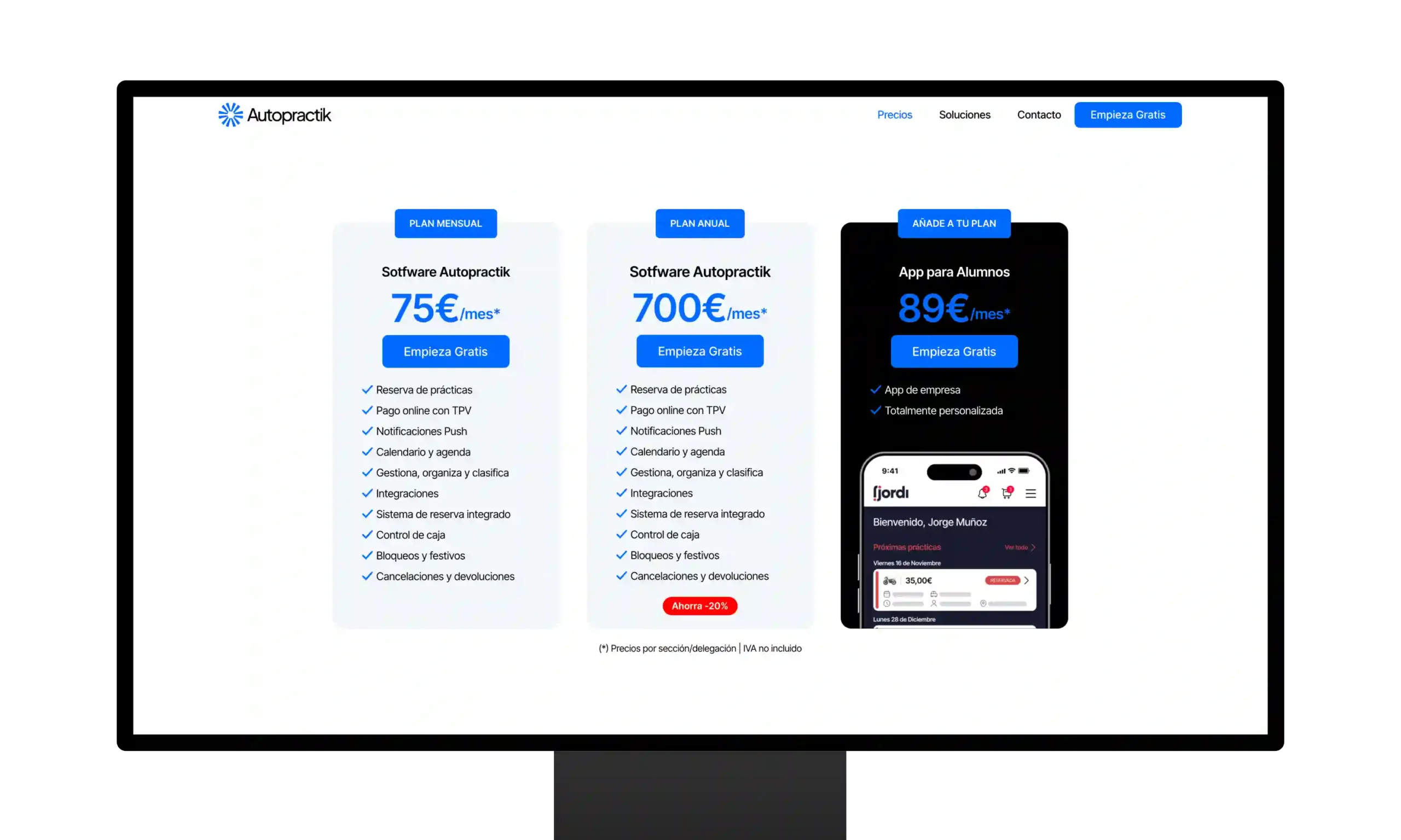
An interactive section allows you to switch between monthly or annual payments, with prices clearly grouped and organized for you to choose the option that best suits your needs.
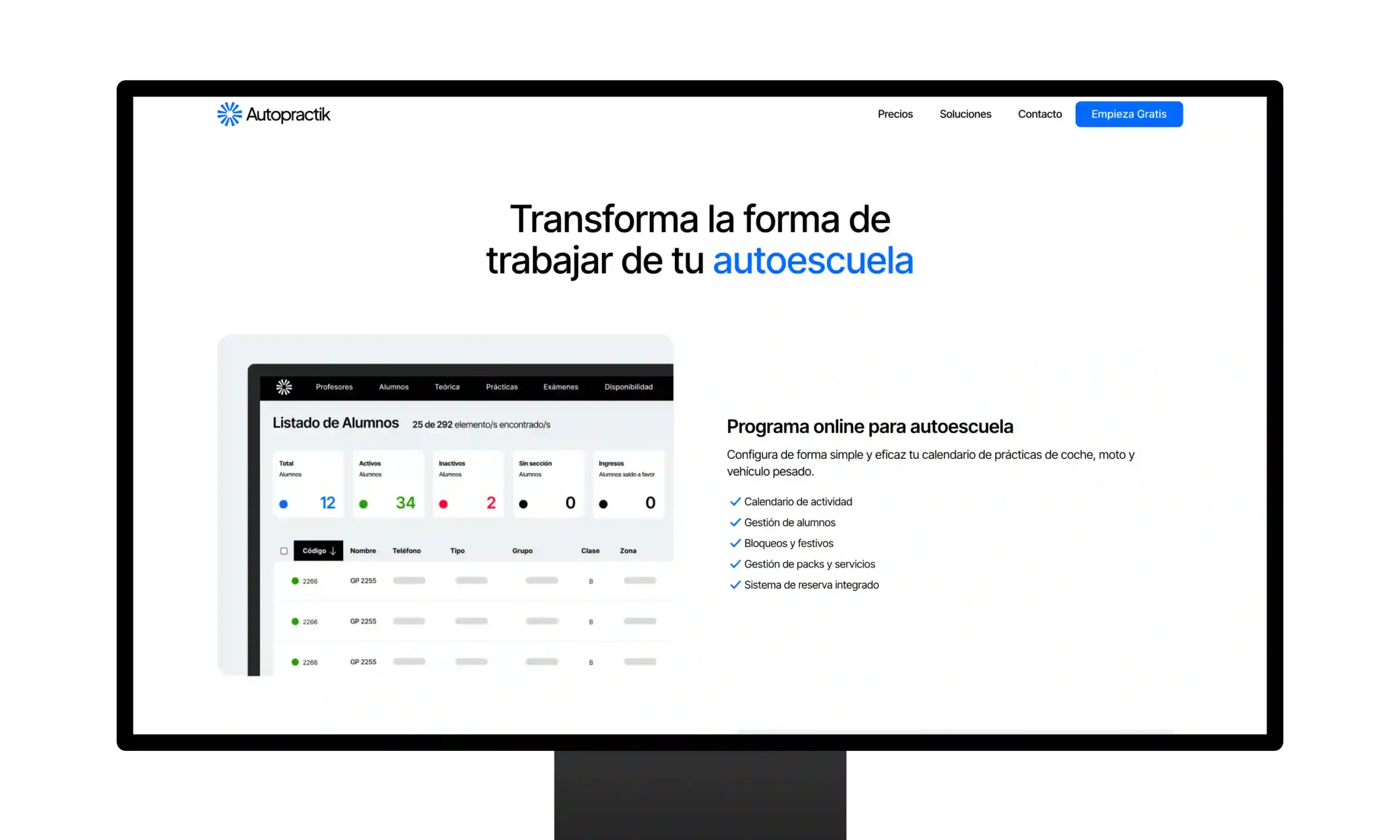
Explore the key advantages of AutoPractik in this section dedicated to showcasing the benefits of the tool, with a clear design that highlights how it can improve your performance and facilitate your training.


Please complete this form as accurately as possible. This will enable me to respond to you more efficiently.
Get startedFor any inquiries, email me at
info@jorgeml.comBy submitting this form, you accept the
Privacy Policy