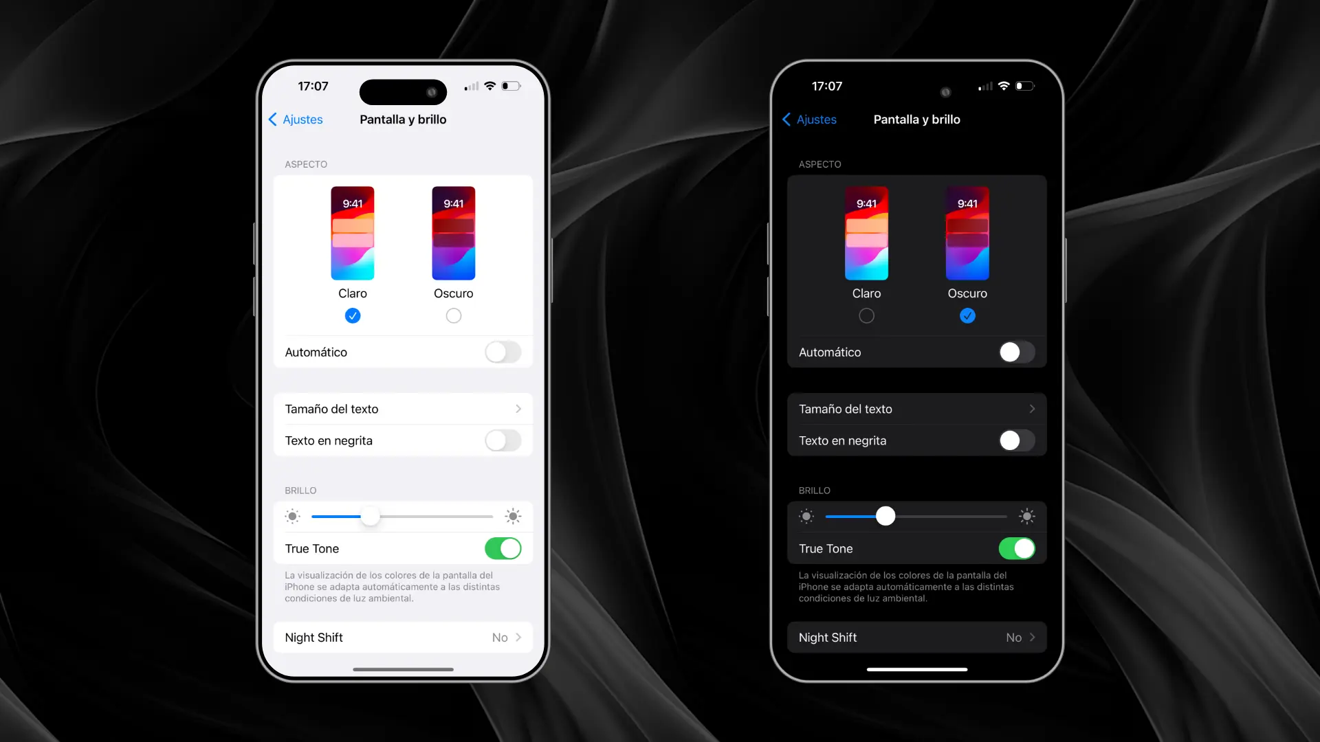
In this article, we explore the key differences between the two modes, their advantages and disadvantages, and how a designer can make the best decision depending on the context of use and user needs. Understanding these options can make the difference between a smooth and enjoyable experience, or one that causes frustration.
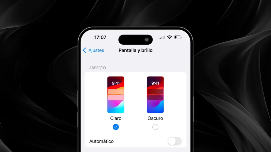
Light Mode
The Light Mode has been the standard in most interfaces for many years. This mode uses predominantly white or light backgrounds with text in dark colors, providing a high contrast that makes it easier to read in certain contexts. The following is an analysis of its most important advantages:
Visibility in bright environments
One of the major benefits of light mode is its excellent readability in bright environments. When users are in spaces with lots of natural light, such as outdoors during the day, black text on a white background is much more visible than in dark mode, where the dark background could generate reflections and reduce visibility.
Familiarity for users
Many users are more accustomed to the clear mode, as it has historically been the standard for most applications and operating systems. This familiarity creates a sense of comfort and predictability for users who have been interacting with white or clear interfaces for years. In addition, clear mode offers an aesthetic that many associate with simplicity and professionalism, which can be especially important for certain types of websites, such as corporate pages or professional portfolios.
Clean and professional appearance
Clear mode tends to convey a sense of cleanliness and order. With its white or light background, it can highlight key visual elements, such as photographs or graphics, without distraction. It is a popular choice for websites and applications looking to project a modern, professional and minimalist image. In the graphic design world, this aesthetic can help focus attention on content without the background stealing the spotlight.
Power consumption of LCD displays
While light mode offers several advantages, it is important to consider its impact on power consumption, especially on devices with LCD screens. LCD displays need to keep all pixels illuminated, which can lead to higher battery consumption compared to dark mode, especially in situations of prolonged use. However, in desktop or laptop devices connected to a power source, this is not such a relevant issue.
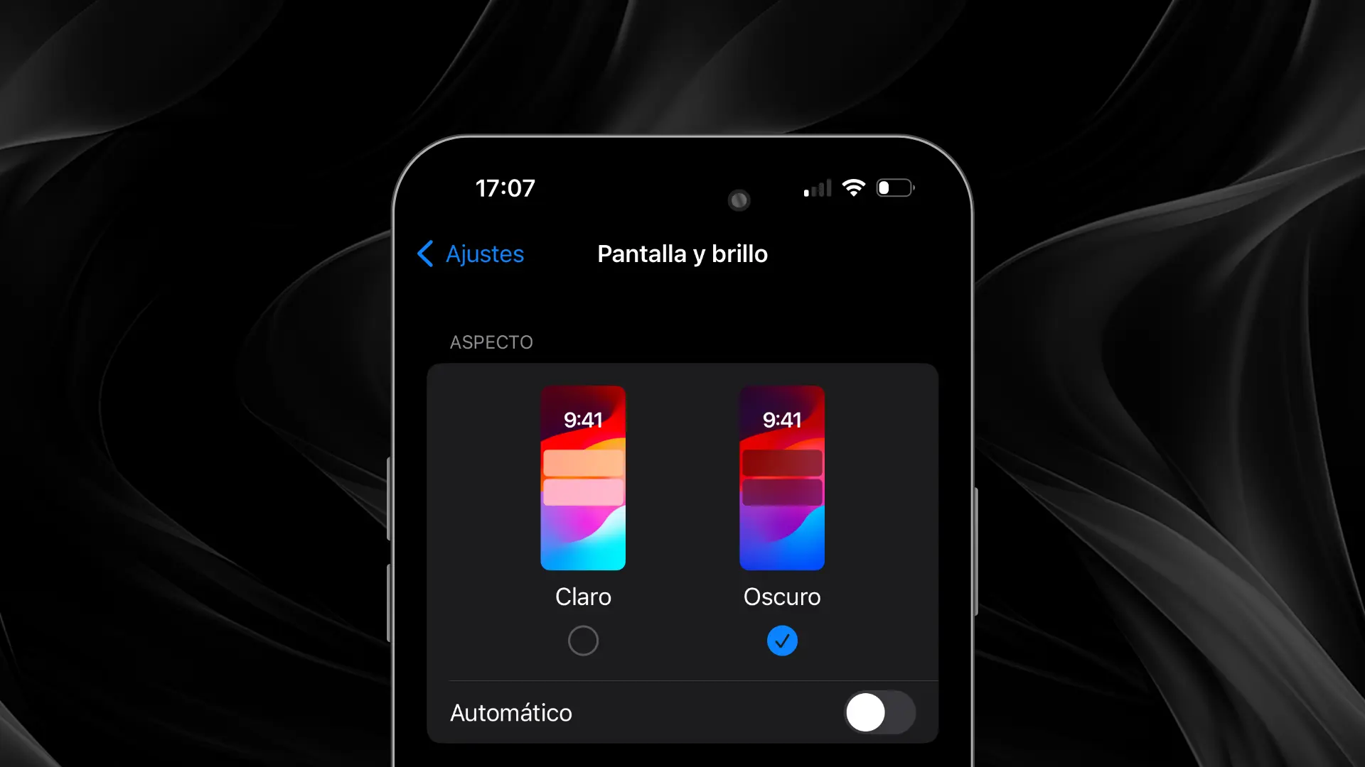
Dark Mode
Dark Mode has gained popularity in recent years due to its ability to improve visual comfort, especially in low-light environments. This mode uses dark backgrounds with light text, creating an inverted contrast compared to light mode. Here are its main advantages:
Reduction of eye fatigue
One of the major benefits of dark mode is that it can reduce eye fatigue in low-light environments. When users use devices in low light conditions, such as at night or indoors in low light, the amount of light emitted by the display in dark mode is less, resulting in less eye strain. This is especially relevant for those who spend long hours in front of the screen.
Energy savings in OLED/AMOLED displays
Another key benefit of dark mode is power savings on devices with OLED or AMOLED displays. These displays turn off the pixels that display black, which can significantly reduce battery consumption when using dark mode. This power savings is most evident on mobile and tablet devices, making dark mode an attractive option for users who are dependent on battery life.
Modern and elegant style
The dark mode is often associated with a modern and elegant design. Many users perceive it as aesthetically appealing, due to its minimalistic and sophisticated style. The contrast between the dark background and prominent visual elements can be very effective for creative applications, video games and multimedia platforms. In addition, it has become a preferred choice for productivity applications and technology platforms due to its professional appearance.
User preferences
With the increasing popularity of dark mode, many users prefer it for certain applications, especially those that are used at night or in dark environments. Customization is key in today's user interfaces, and offering dark mode can enhance the user experience by giving them the option to choose the mode that best suits their preferences and context of use.
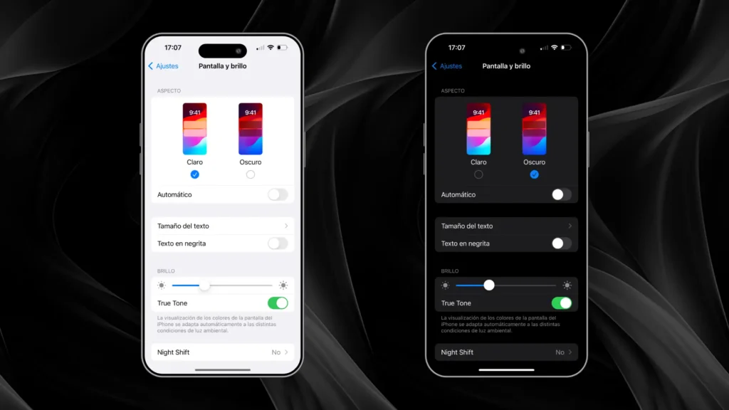
General Considerations for Choosing Light Mode or Dark Mode
When designing an interface, it is important to consider some key factors that go beyond simple aesthetics. Both light and dark modes have their benefits, but the choice depends on the context of use, user preferences and accessibility. Here are some points to keep in mind when making a decision:
Accessibility in display modes
It is crucial that both light and dark modes are accessible to all users, including those with visual impairments. Some people may have difficulty reading text on very light or very dark backgrounds, so it is important to ensure that there is sufficient contrast and that the design is compatible with assistive technologies such as screen readers.
Maintain consistency in the interface
A good practice is to maintain consistency in design regardless of the mode the user chooses. Key elements of the interface, such as buttons, icons and typography, should remain visually consistent to ensure a smooth experience. This does not mean that both modes should be identical, but there should be a correspondence in the layout and functionality of the elements.
User system preferences
Today, many operating systems allow users to configure their viewing preference (light or dark mode) based on the time of day or their personal preferences. Considering and respecting these system preferences in your design allows the application or website to automatically adapt to what the user has already configured on their device, improving personalization and the user experience.
Importance of adequate contrast
A fundamental aspect of design, whether in light or dark mode, is the contrast between text and background. Maintaining proper contrast is essential to ensure that content is legible to all users. Dark text on a light background is usually more legible in light mode, while light text on a dark background must be carefully designed to avoid looking faint or dull in dark mode.
User testing to validate decisions
User testing is critical to understanding how users interact with each display mode. This testing can help you identify preferences, accessibility challenges and potential areas for improvement. The goal is to create a balanced experience that works well in both modes and ensures that all users enjoy optimal interaction.

Design Tips for Light Mode and Dark Mode
Visual marking with variations in light and dark mode.
When designing interfaces that work in both Light Mode and Dark Mode, it is essential to ensure that both modes maintain a consistent and attractive appearance. Here are some key tips to ensure that your design is effective in both environments:
Adapting the brand colors to both modes
One of the biggest challenges when designing for both modes is adjusting the brand colors. Some colors may look completely different in dark mode compared to light mode, especially if dark backgrounds tend to absorb certain tones. It is advisable to create mode-specific color variations that maintain the brand identity but adapt well to different lighting.
Images and media in both modes
Images and media must adapt to both modes without losing quality or visibility. Images with transparent backgrounds or light colors may not work well in dark mode, and vice versa. Consider adjusting the background colors or brightness of images so that they look good in both modes. You could also offer alternate versions of images or graphics, depending on the mode selected.
Smooth transitions between modes
If you decide to offer users the option to switch between Light Mode and Dark Mode within the same application or website, make sure that the transition between the two modes is smooth. The change from one mode to the other should be natural, without generating flickering or abrupt changes that may be uncomfortable for the user. In addition, it is important that changes in the interface are made in a logical manner, without disorganizing the elements or affecting the user experience.
Conclusion: Light Mode or Dark Mode?
The choice between Light Mode and Dark Mode is not a simple decision and depends on multiple factors. While Light Mode offers greater visibility in bright environments and is familiar to many users, Dark Mode is gaining ground thanks to its modern styling, reduced eyestrain in dark environments, and power savings on mobile devices with OLED/AMOLED displays.
It is best to offer both options, if possible, to accommodate the preferences and needs of all users. In addition, respecting system preferences and ensuring that both modes maintain visual and functional consistency is key to an excellent user experience.
Designing for Light Mode and Dark Mode not only improves accessibility and interface aesthetics, but also demonstrates a commitment on the part of the designer to create flexible, modern, user-centric products.
