Le Baron
- Services
- BrandingWebSocial Media
- Technologies
- FigmaWordPressBricks Builder
- Location
- Barcelona
- Industry
- Real Estate
Earth and water
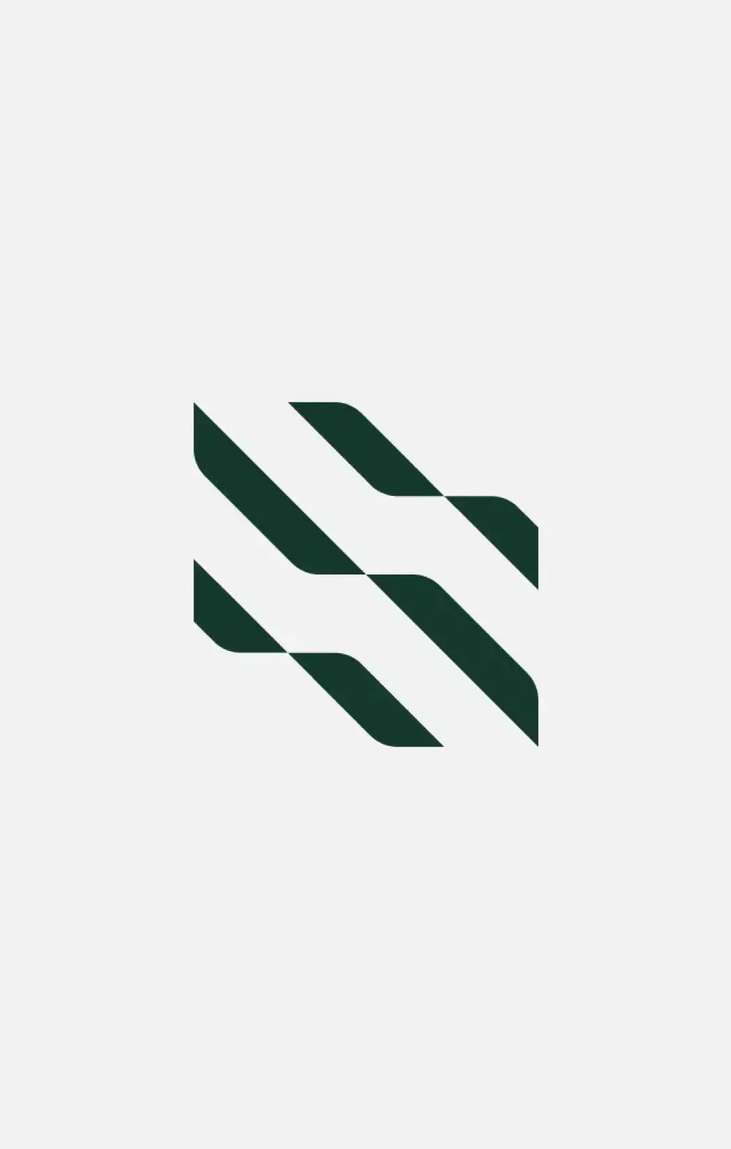
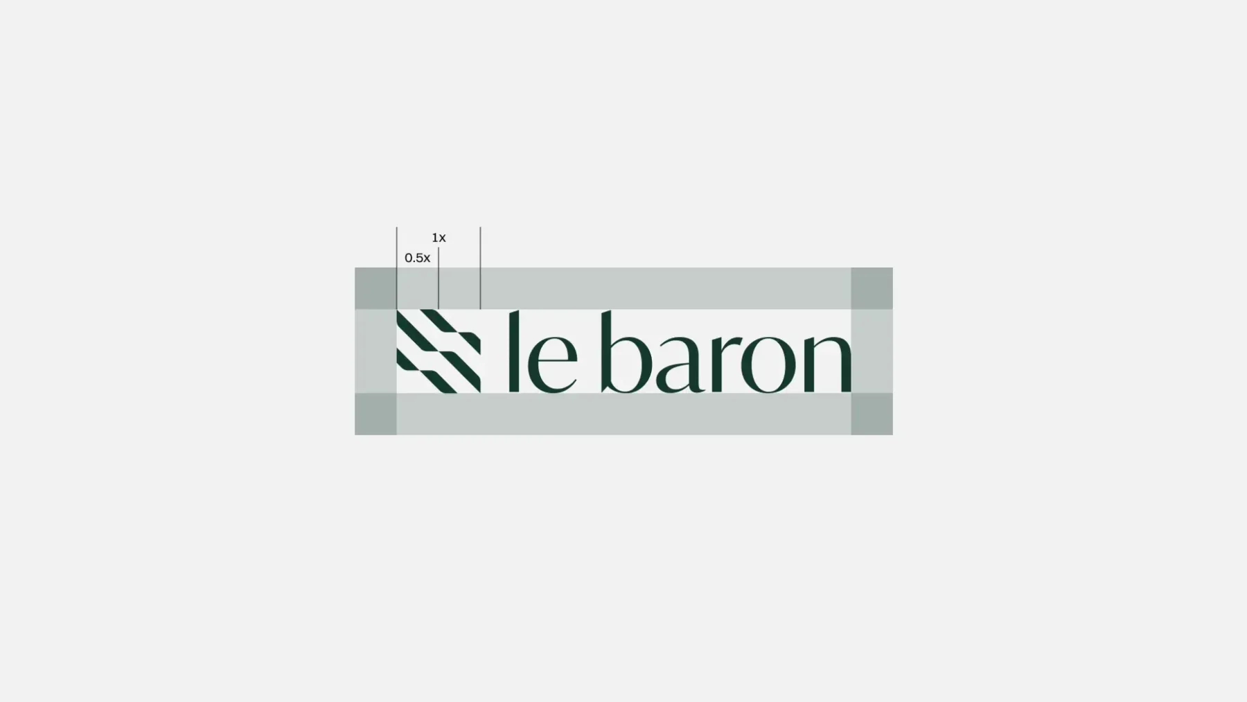
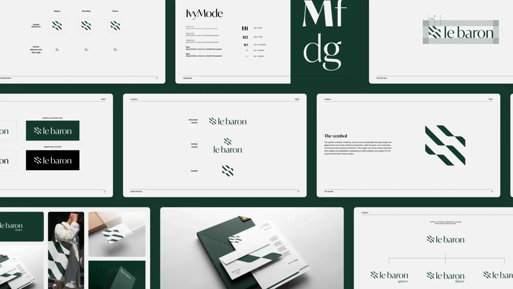
Le Baron is a Barcelona real estate developer that builds with respect for the environment. Its symbol grows out of that idea: two diagonal planes that interlock, evoking earth and water. We paired it with an elegant serif typeface and a palette of deep green and cream for a calm, natural, high-end identity.
An identity you can live in
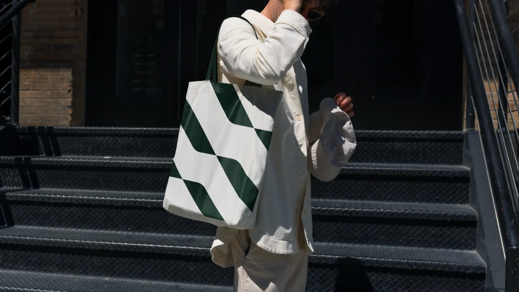
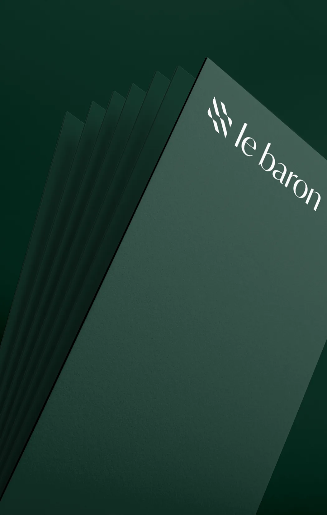
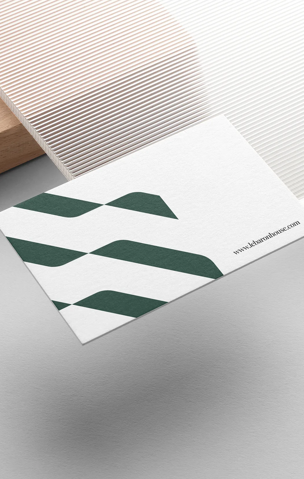
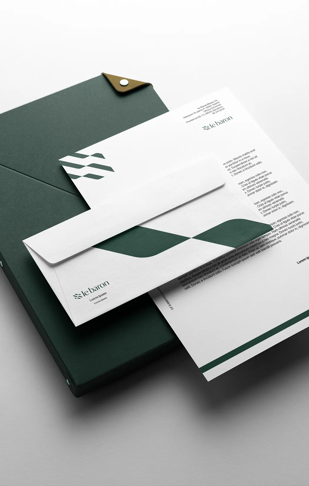
We rolled out the system across every touchpoint: stationery, business cards, folders, and applications on apparel and products. The diagonal pattern of the symbol becomes a flexible graphic device that preserves the warmth and attention to detail that define the brand.


Website and social media
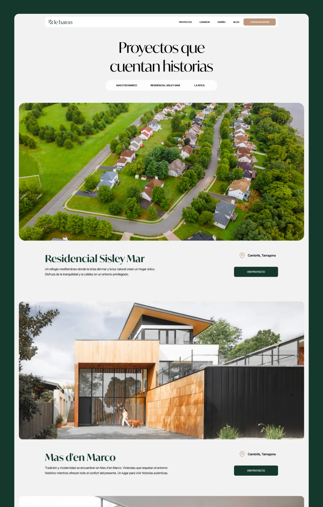
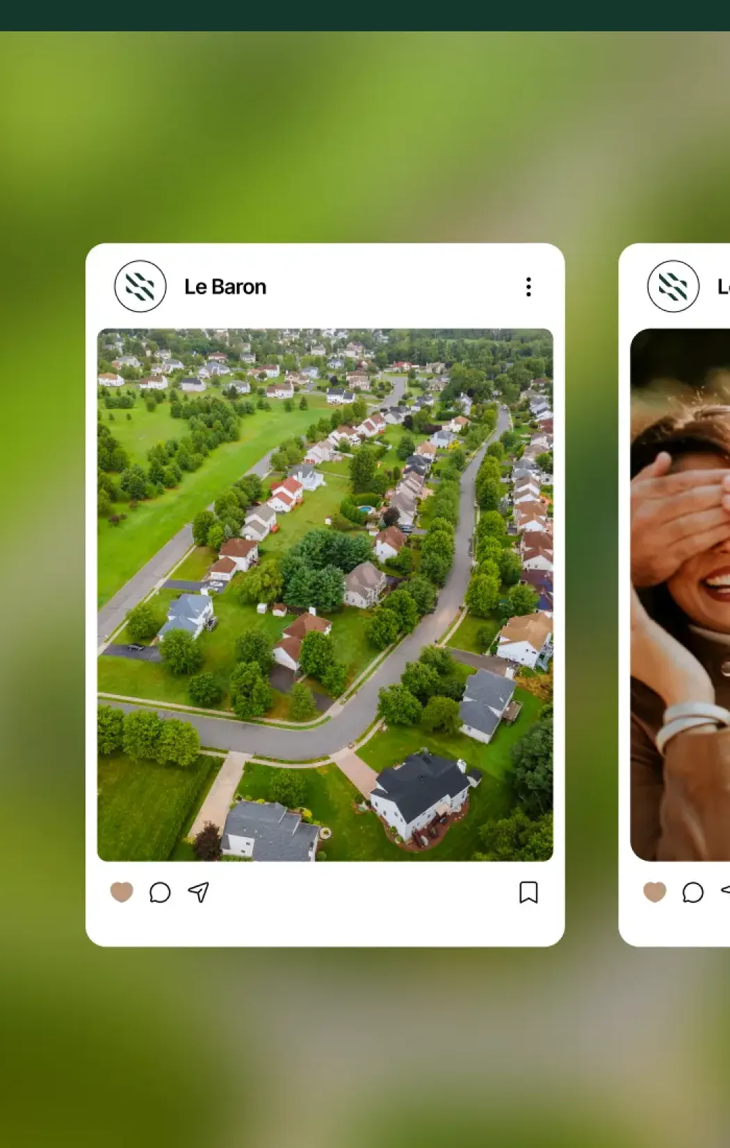
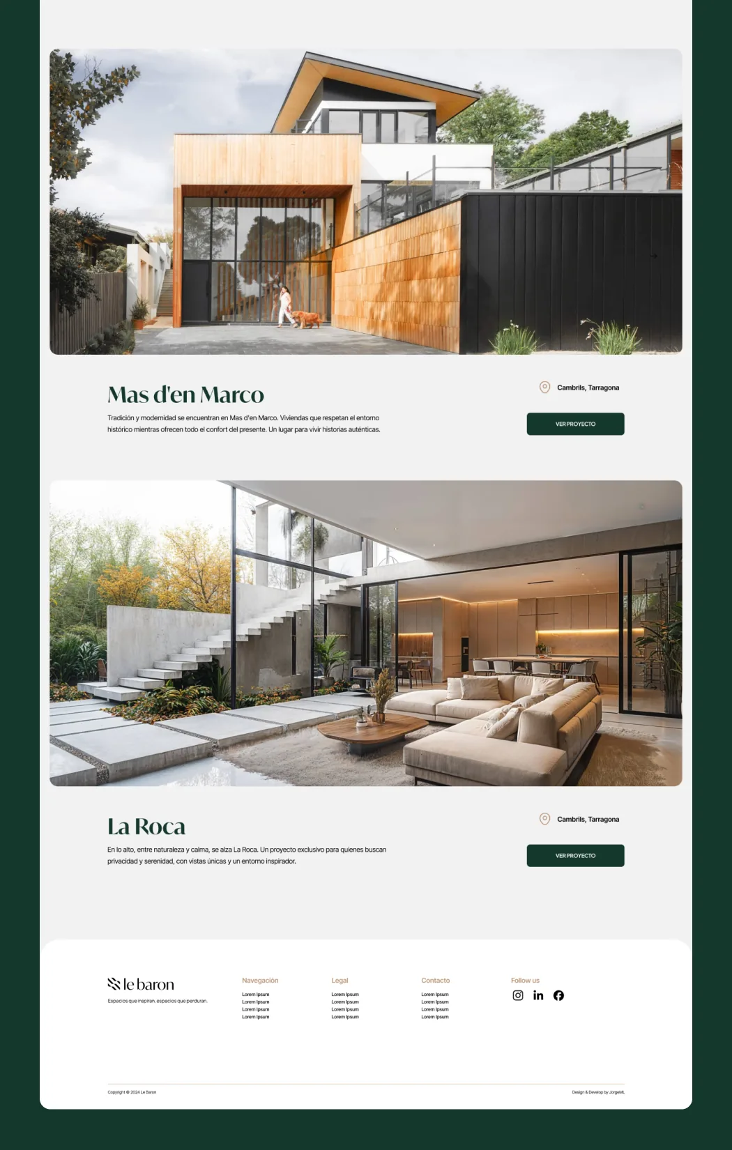
We designed and developed a custom WordPress website with Bricks Builder, built so the team can publish their own developments without touching code. A website that tells stories—each project with its own location and character—and extends into a social media template system that stays consistent across every channel.
Results
4,322
Up 108%
Visitors
1m 13s
Up 94%
Visit duration
18%
Down 52%
Bounce rate
97
Up 42 points
PageSpeed
Working with Jorge was a great call. From the very beginning he understood exactly what we needed and turned it into a clear, thoughtful and very well-executed proposal. I’d especially highlight his commitment throughout the project and his ability to bring solutions that improve on the original idea.