RNO Financial
- Services
- BrandingWeb
- Technologies
- FigmaWordPress
- Location
- Sydney
- Industry
- Financial Services
Three shapes, one family
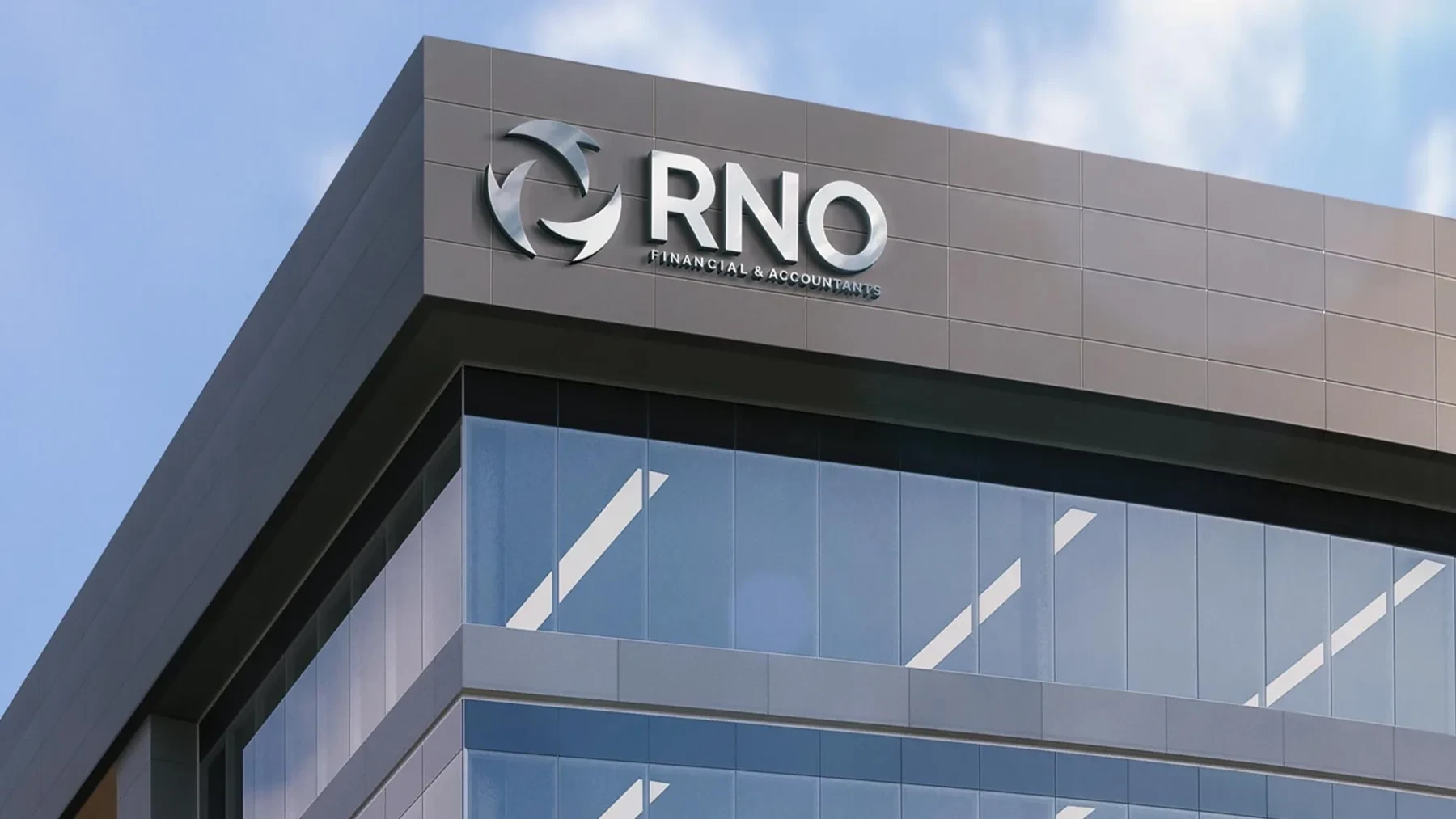
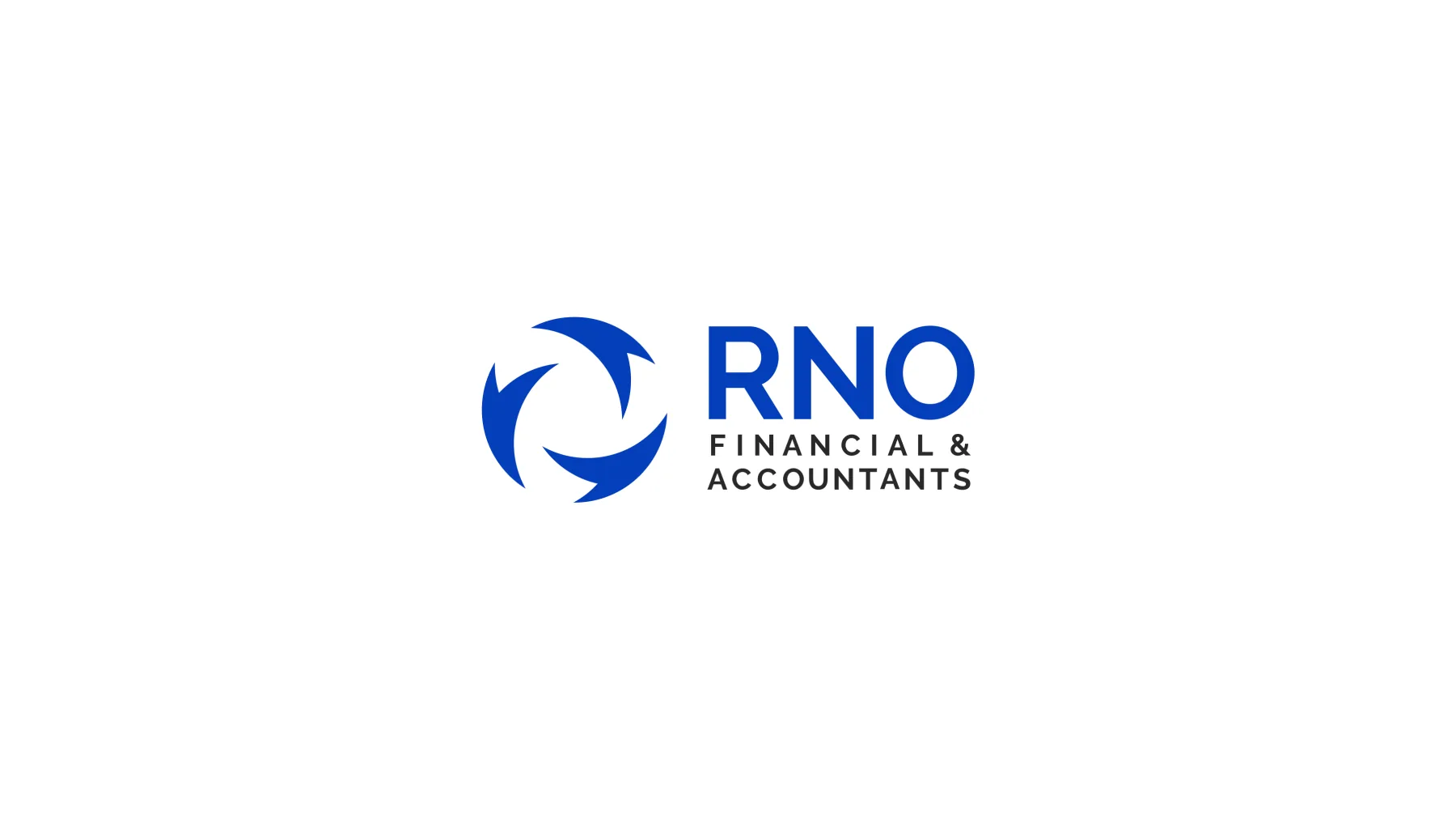
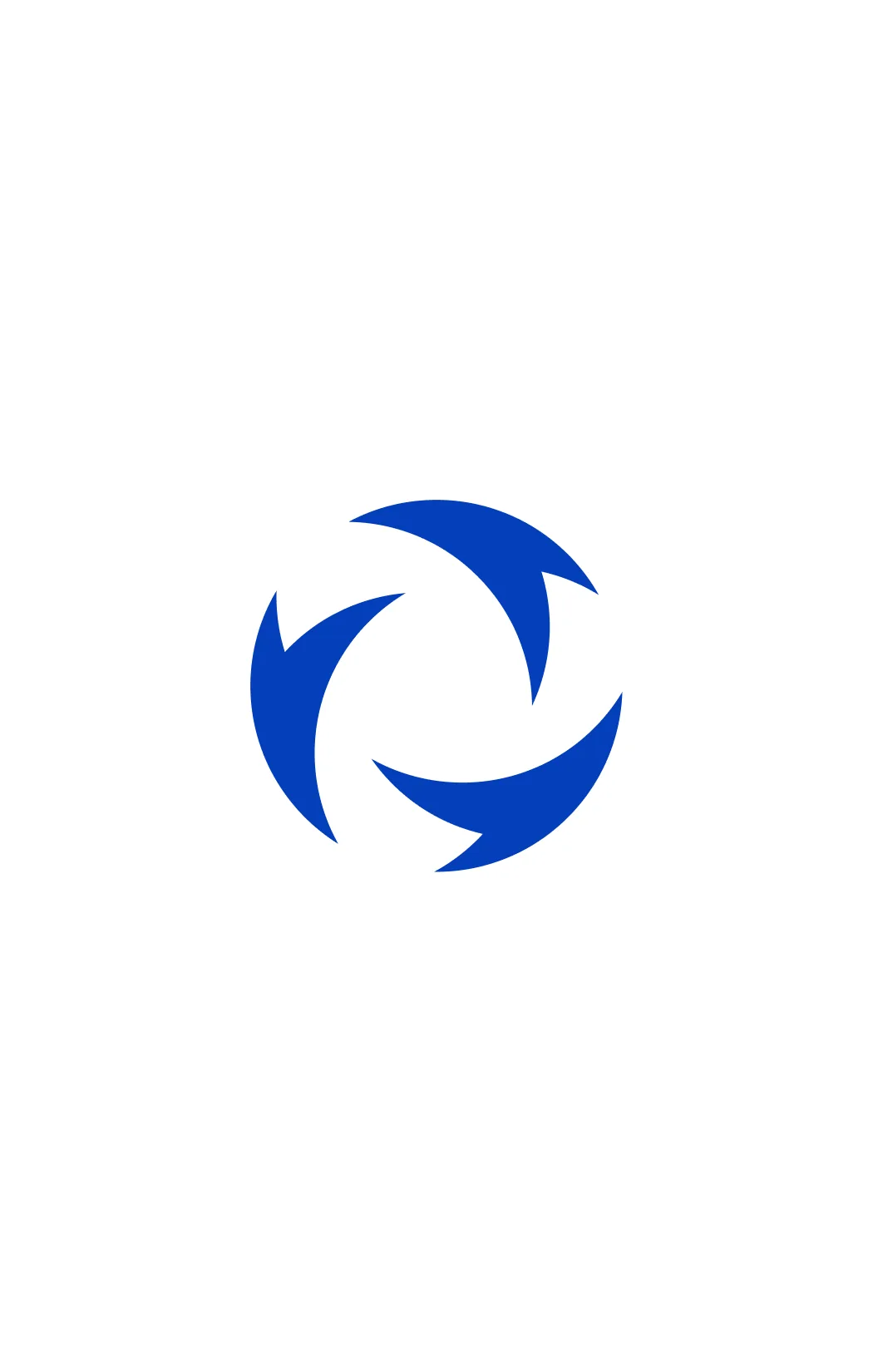
RNO are the initials of the founder's three children, so we built the logo around that idea: three shapes rotating together in a circular emblem, a symbol of family, unity, and movement. A professional yet approachable identity in a corporate blue that conveys the trust people expect from a financial firm.
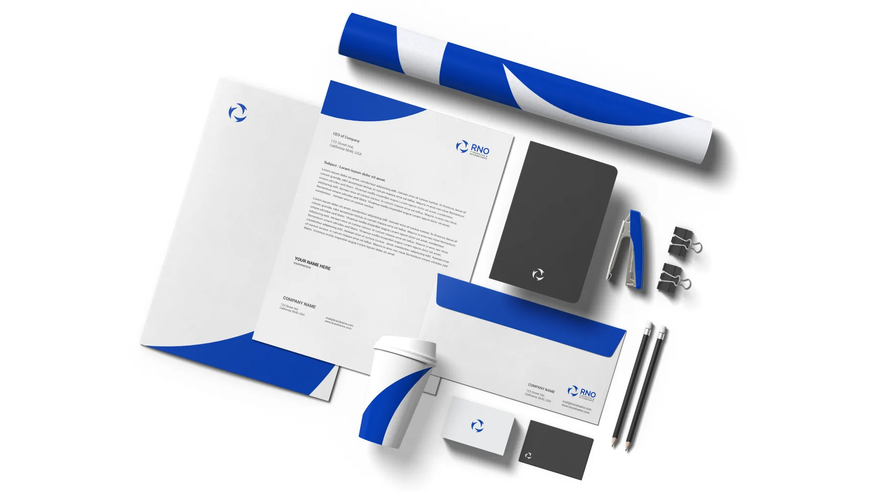
A complete brand system
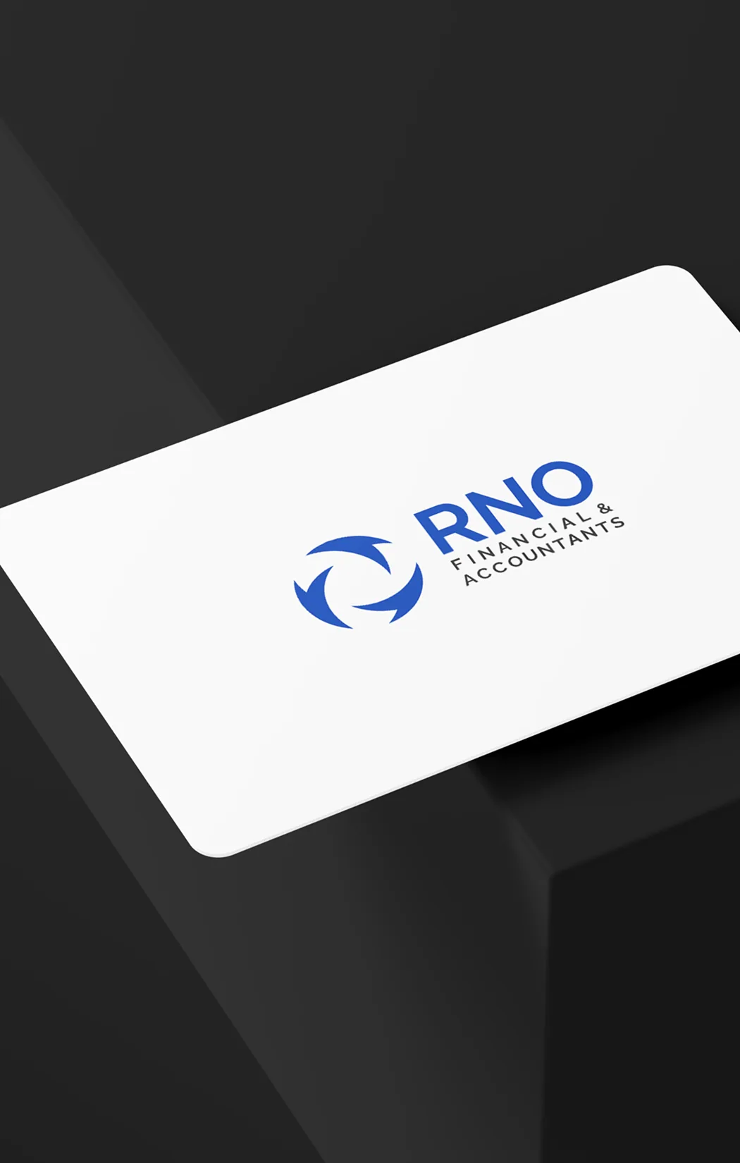
We carried the identity across every touchpoint: stationery, business cards, envelopes, notebooks, and templates, with a cohesive system of blue, white, and black. Each piece reinforces the image of a rigorous, trustworthy firm, ready to serve its clients at the highest level.

Web design and development
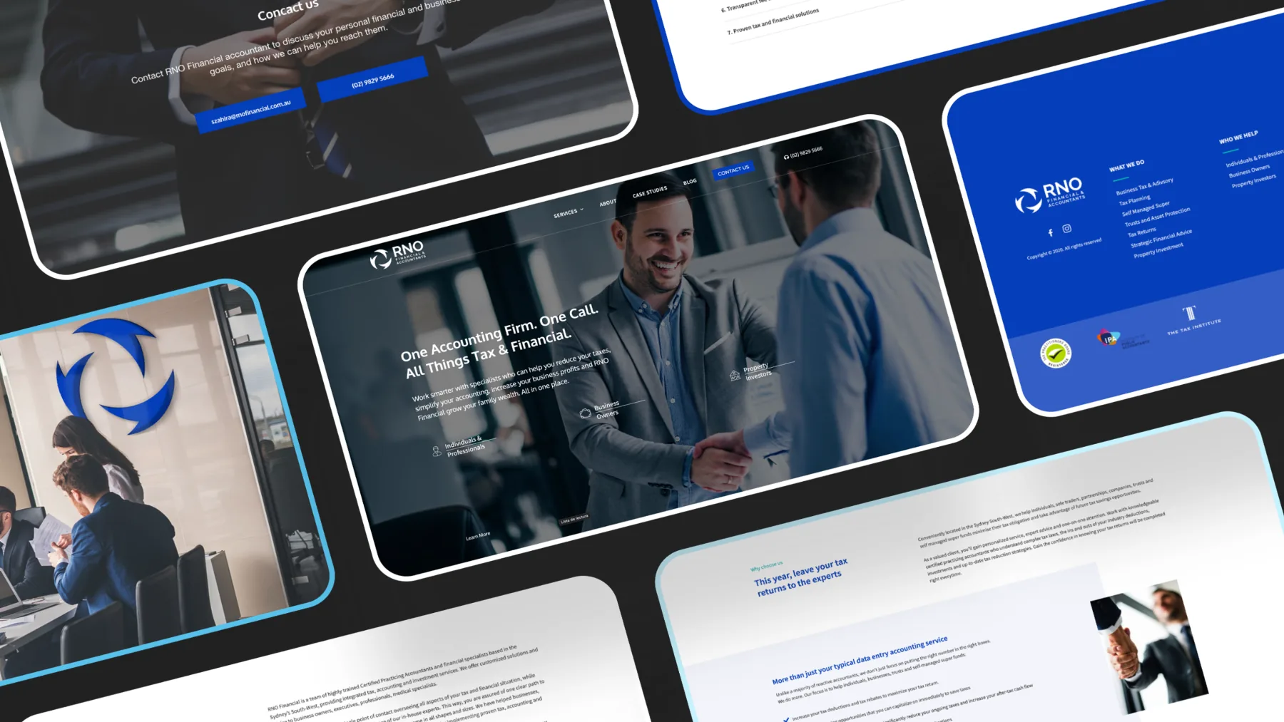
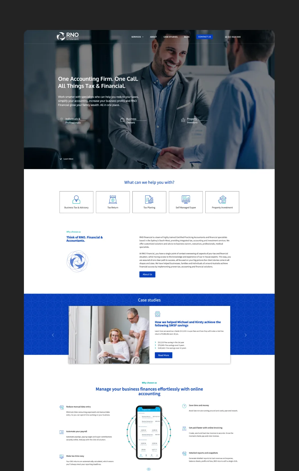
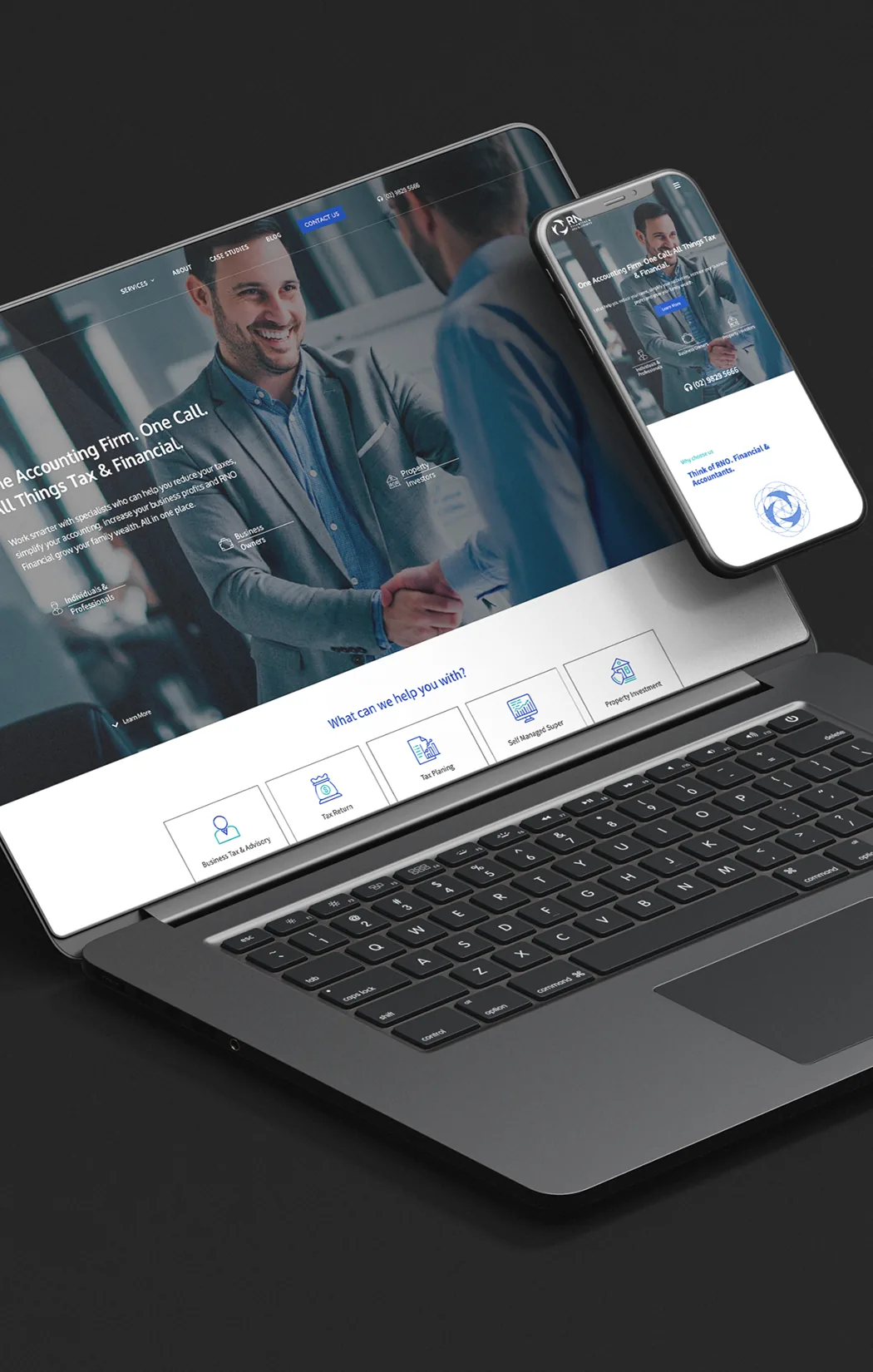
We designed and developed its website: a clear, professional platform that presents its services—tax, business profitability, and growing family wealth—and guides clients toward getting in touch. A website built to inspire trust from the very first moment.