Dupla
- Services
- BrandingSocial Media
- Technologies
- IllustratorPhotoshop
- Location
- Barcelona
- Industry
- Sports
The pair as a symbol
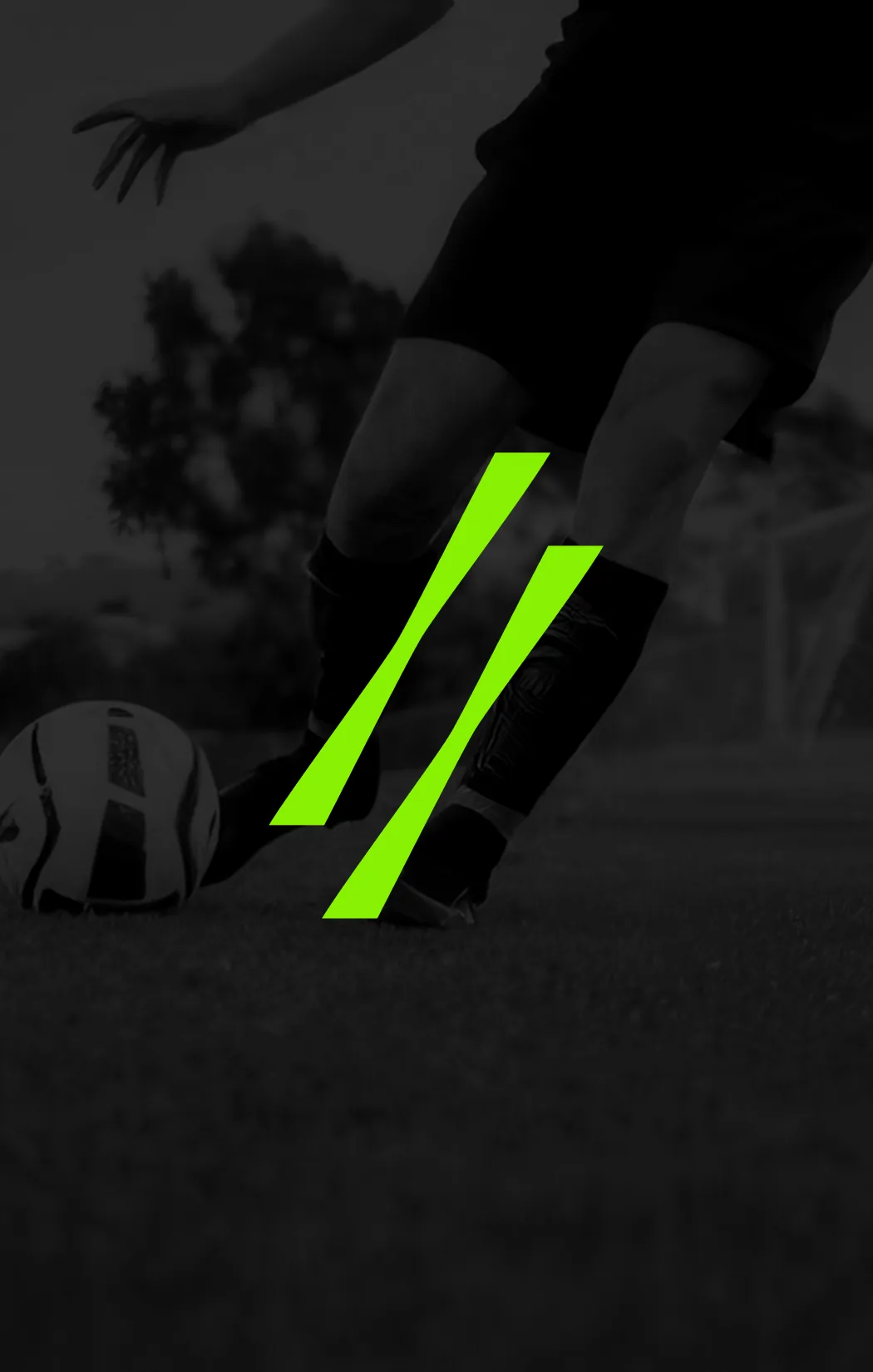
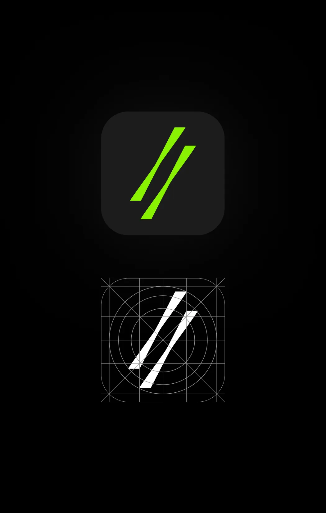
Dupla grew out of a simple, powerful idea: protection takes two. The name and the symbol—two slanted bars moving forward in parallel—capture that idea of a pair, speed, and movement. The identity is built on a clean lowercase wordmark, a contemporary sans-serif typeface, and a high-contrast system: pure black and an electric lime green that brings energy and a competitive attitude.


Design that adapts to you
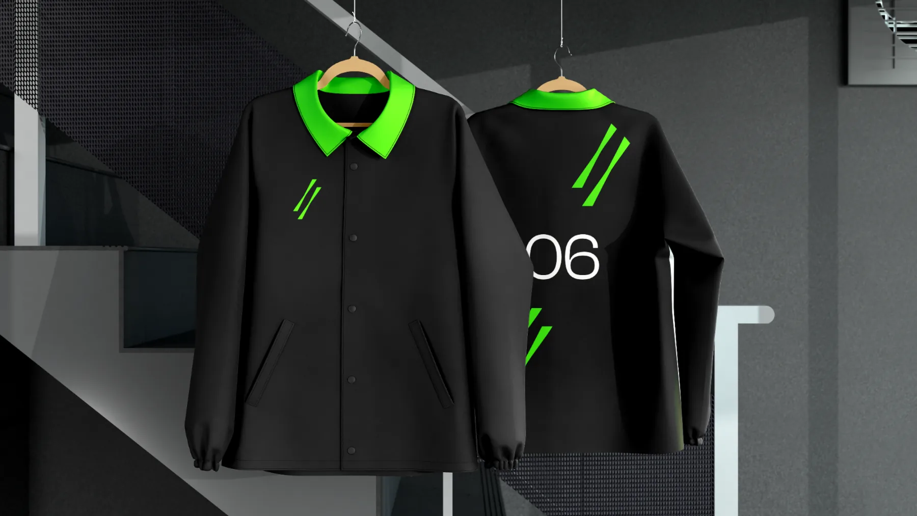
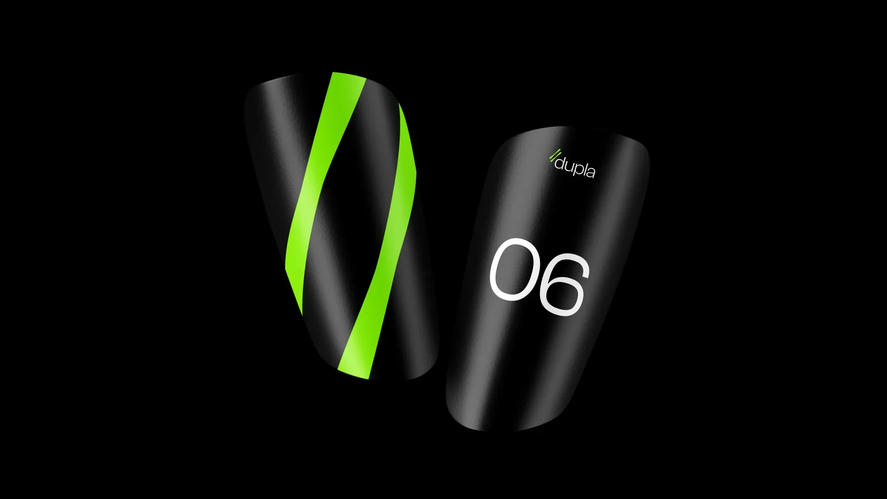
The product is the heart of the brand: shin guards made from a thermo-adaptive material that, once dampened, molds to the exact shape of each leg for a perfect fit. We carried that promise of personalization and performance across every touchpoint—numbering, app iconography, and apparel applications—always keeping the two-bar signature and the brand green.
A brand you can wear
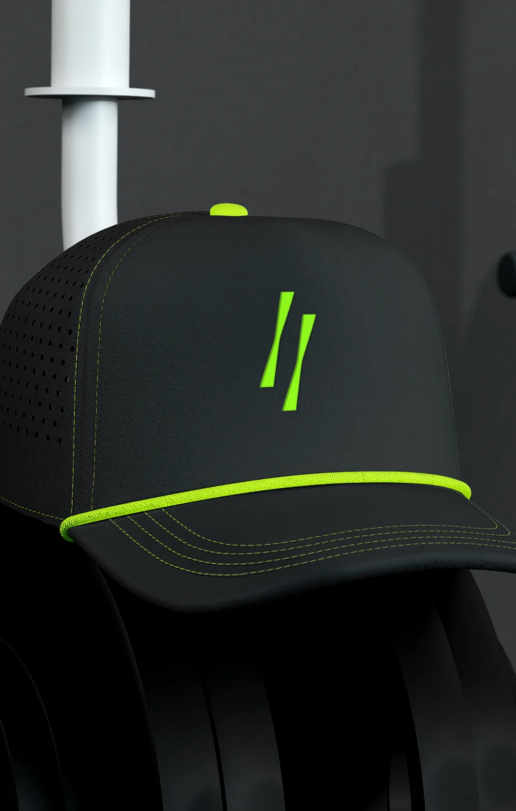
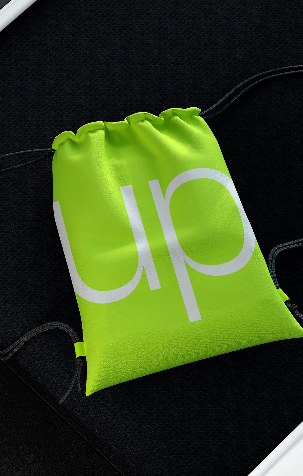
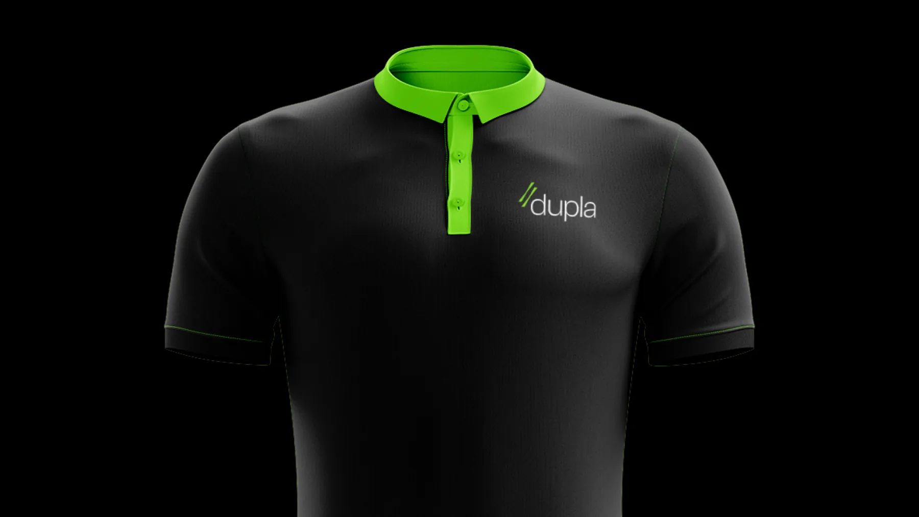
We extended the identity to a full line of gear and merchandise: performance apparel, a cap, and a drawstring bag that use black and lime green as an instantly recognizable code. Every piece reinforces the consistency of the system and makes Dupla a sports brand with a personality of its own, on and off the field.