Ascent Global Group
- Services
- BrandingWeb
- Technologies
- FigmaWordPress
- Location
- Sydney
- Industry
- Construction & Infrastructure
An A that ascends
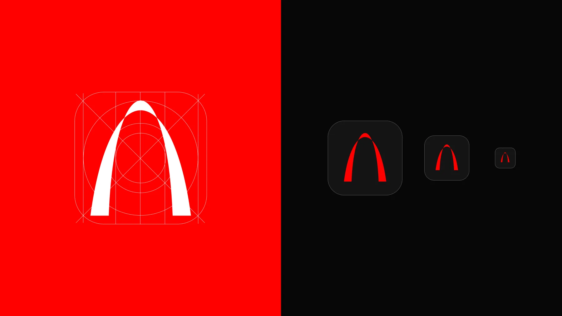
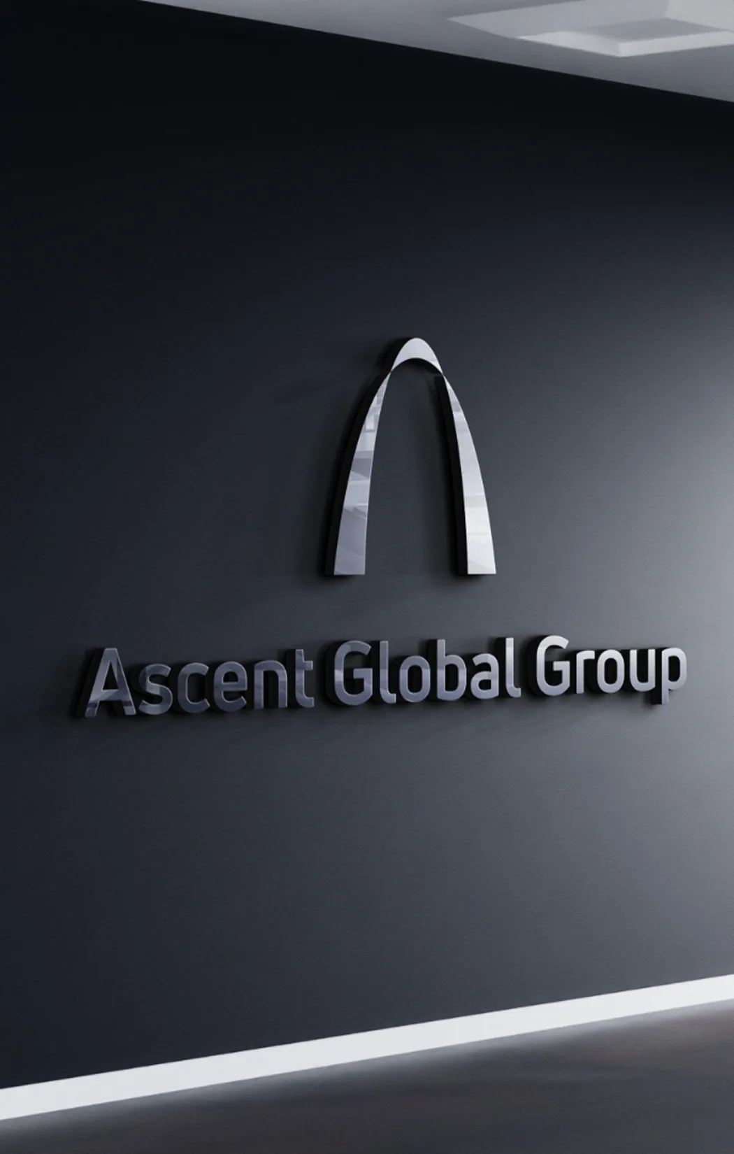
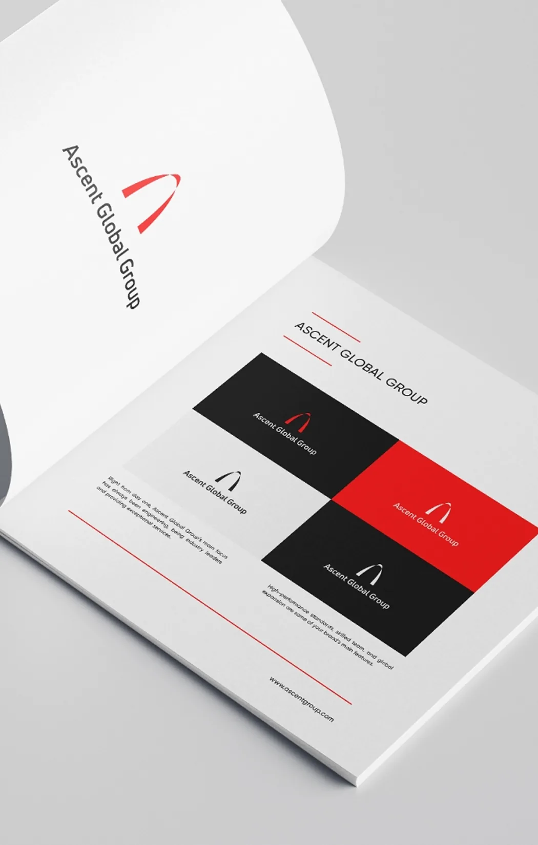
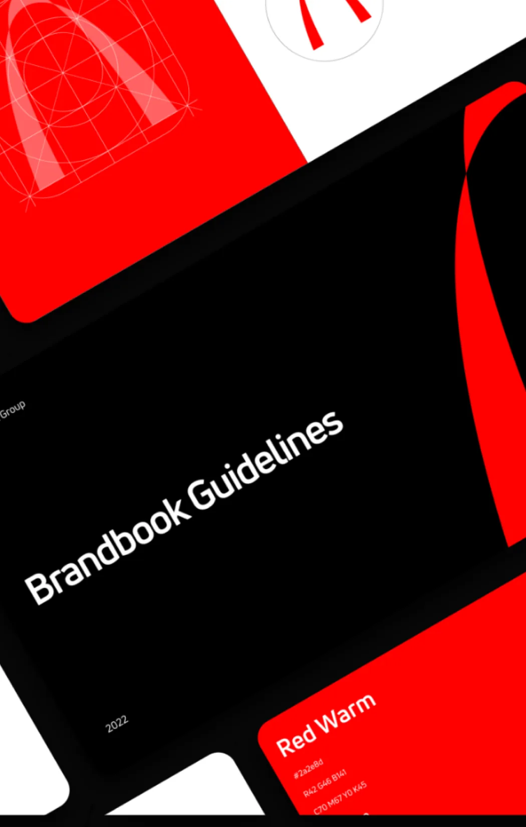
The logo grows out of a single idea: ascent. We built the “A” in Ascent by merging three signs—the letter, the curve of a catenary, and an upward arrow—into a bold red arch that conveys progress, strength, and movement. An understated, professional identity on a palette of red, black, and white, befitting a major Australian company.

A presence in every sector
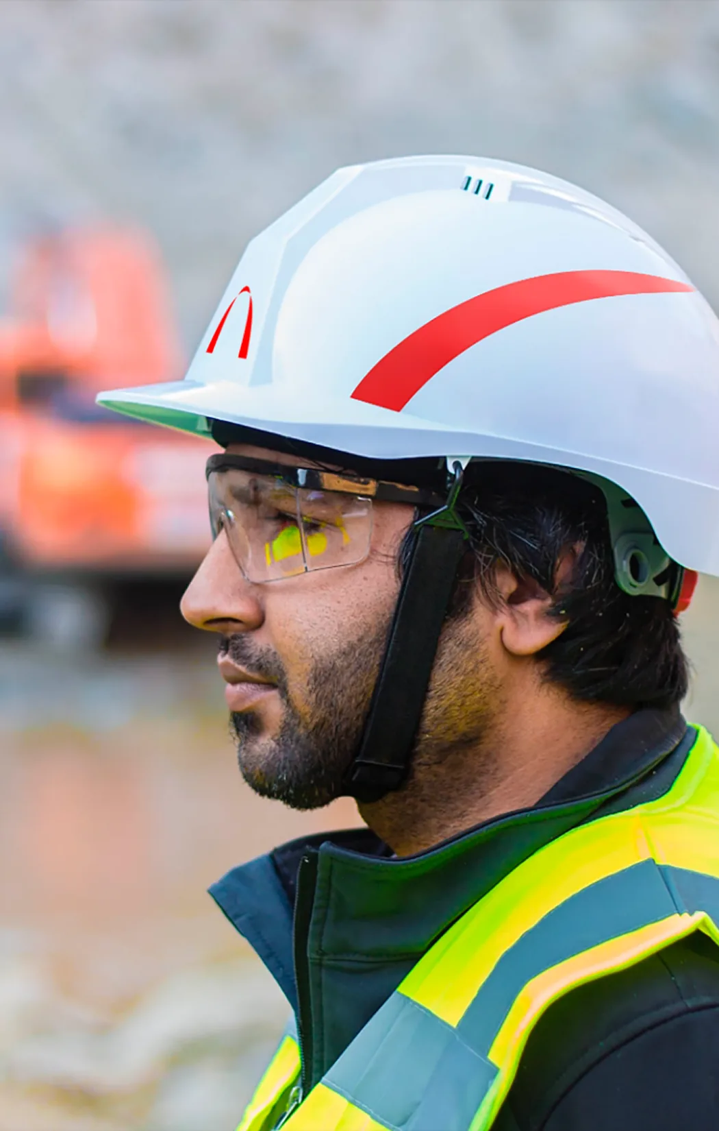
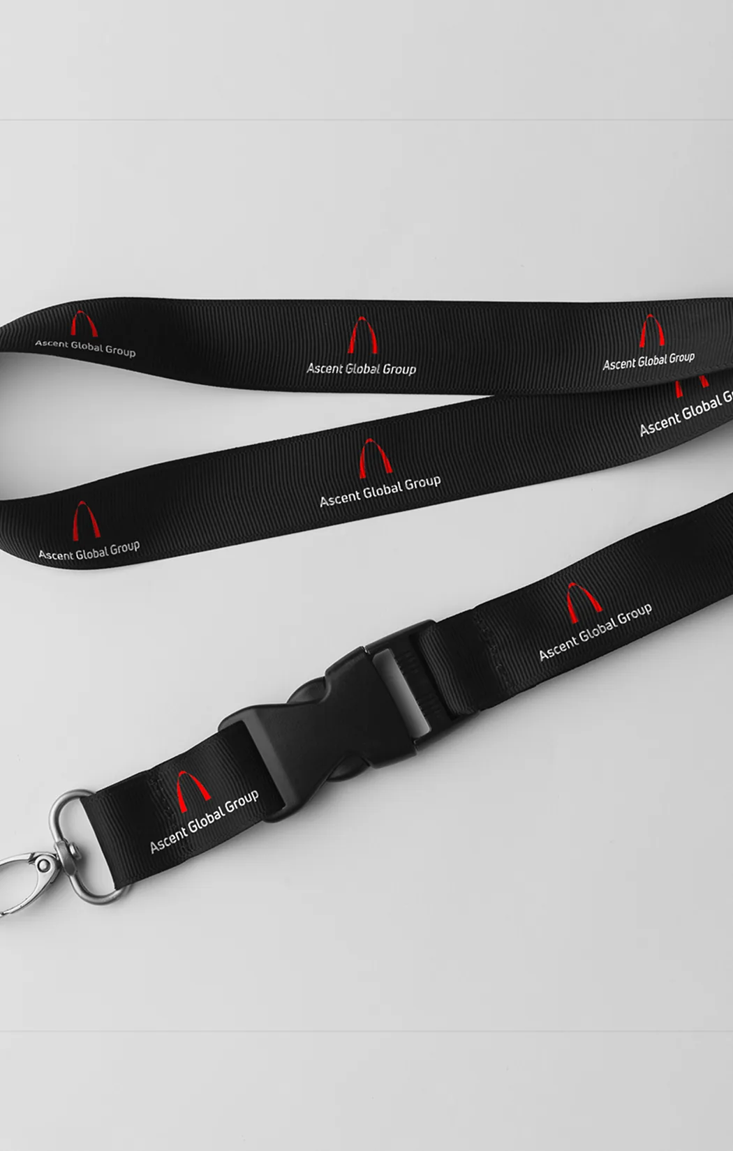
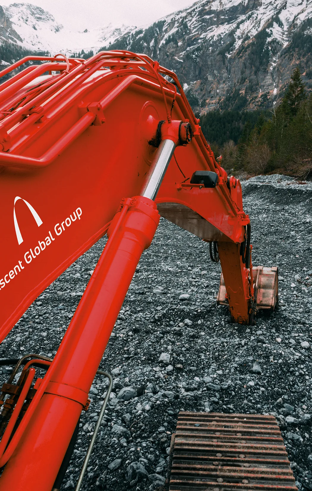
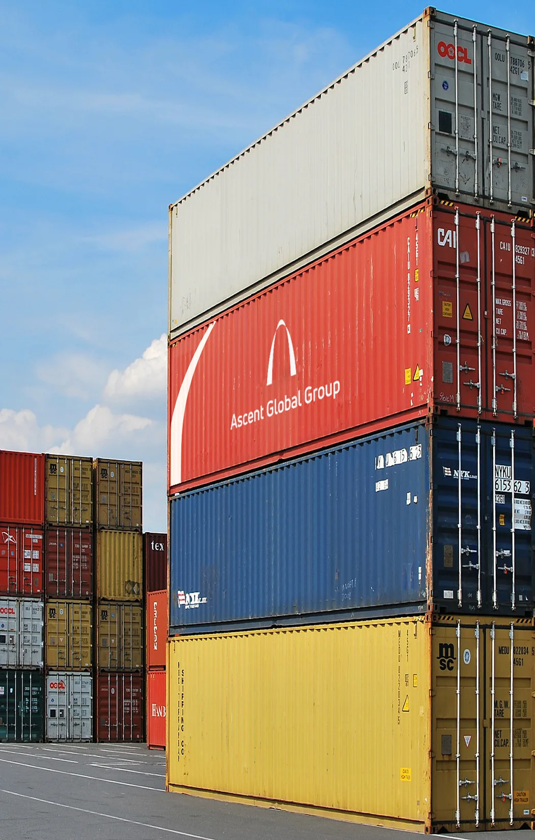
Ascent operates across construction, infrastructure, mining and resources, rail, roads, water, and telecommunications. The brand was designed to hold up in that demanding environment: the red arch keeps the same impact on an industrial building, on heavy machinery, or on a shipping container, ensuring instant recognition at any scale and on any medium.


Digital identity and website
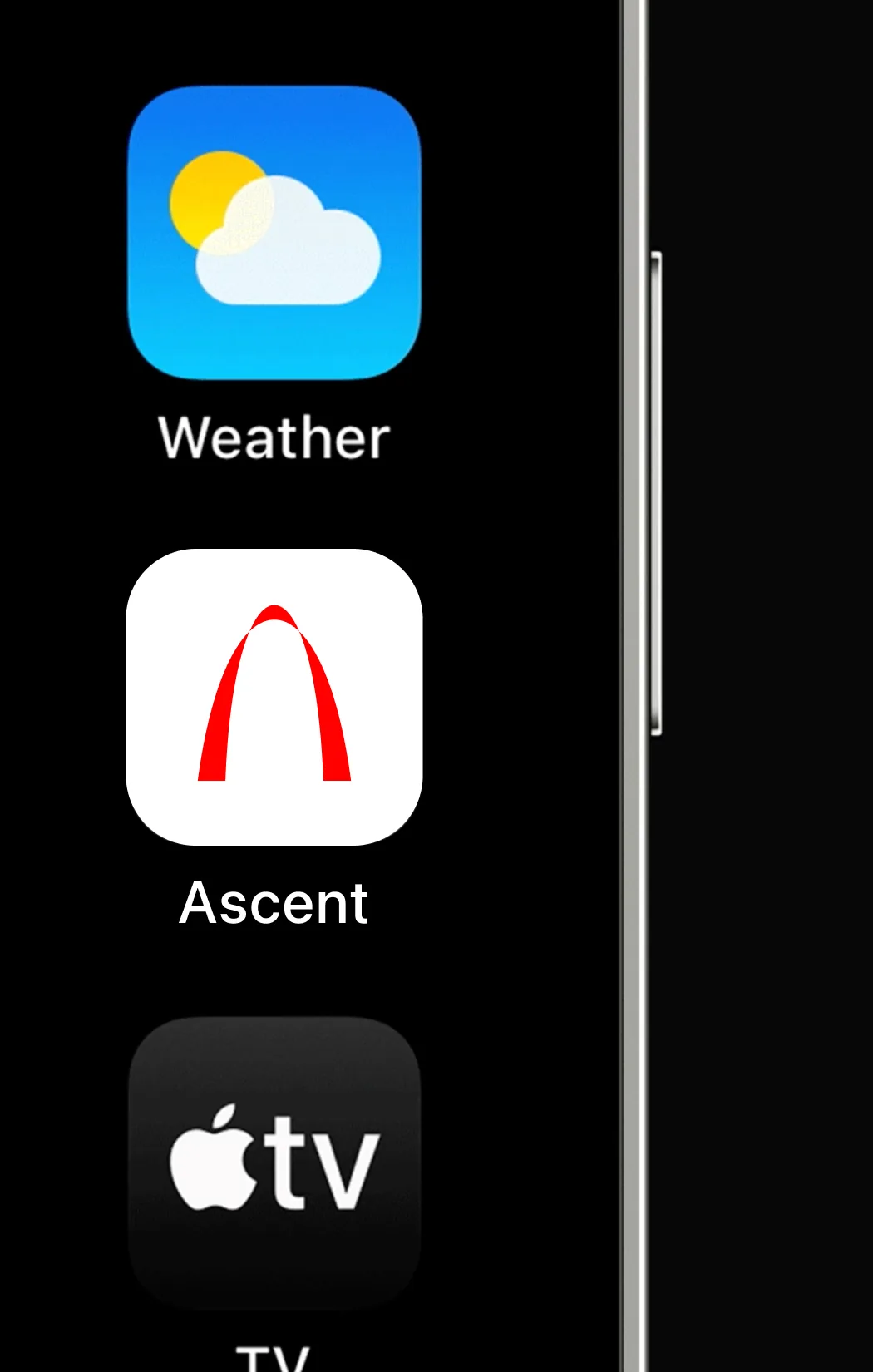
We brought the identity into the digital space with an icon system and app identity, and designed and developed a custom WordPress website. A platform built for the company's day-to-day: the team can publish and manage their own projects independently, keeping the site up to date without relying on third parties.